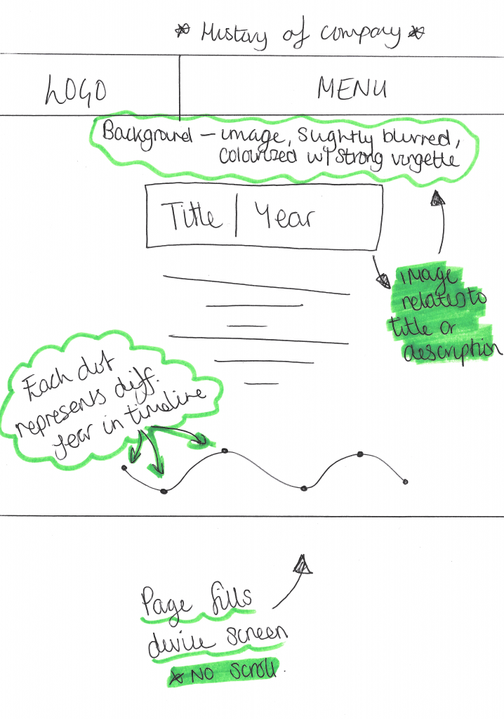
The Company History webpage is another page that will feature on the original site, although its not necessarily important to have, it gives the company authenticity as being a long standing establishment and also makes them appear more personal to the audience. At the bottom of the page there will be a dotted path representing the timeline of the company, with each dot representing a key year or point in their development as an establishment. The key year/point will then be explained in greater detail above where the text can be seen, this will also follow the in-house text style. The background to the page will follow similar conventions used through the website, featuring a dark background to put emphasis on the timeline and will also a vignette for subtle variation – A colourised image might also be used within the background, depending on the text, a image related to that will also shown in the background to make it unique. Lastly, the page will also be designed to fill the device’s screen fully, allowing for no scroll features for the audience, this will again put the main emphasis on the video and giving them nothing to be distracted by on the page.
Learning Agreement
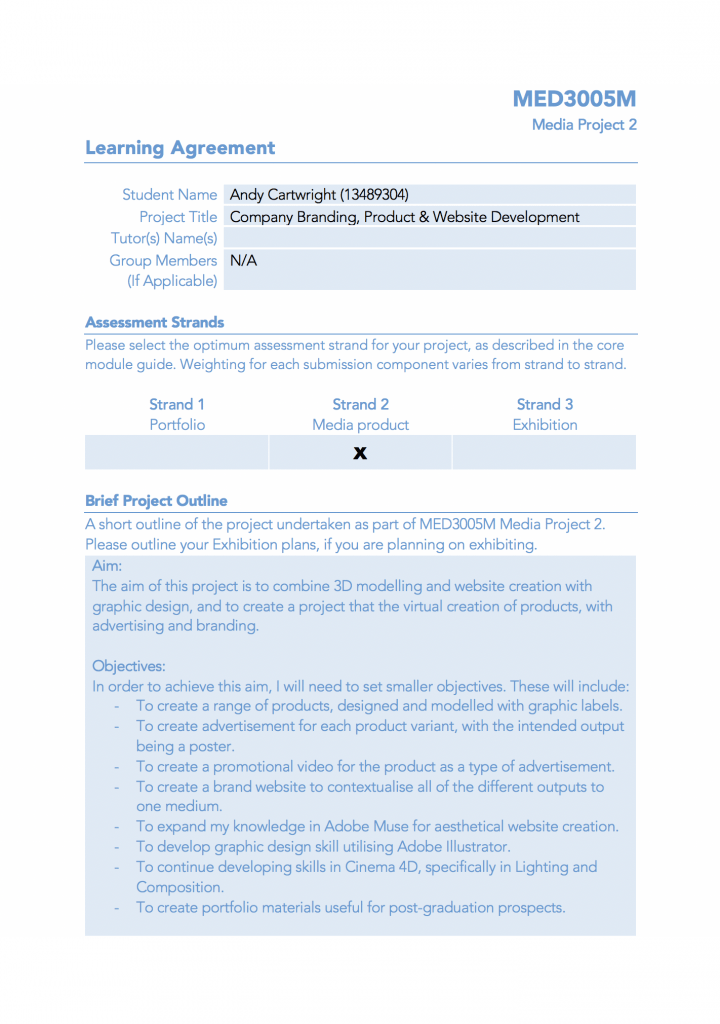
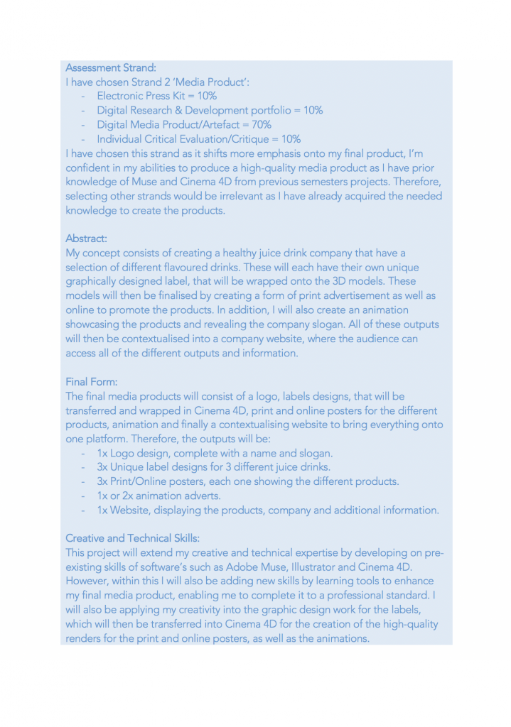
This is my learning agreement, within this document I have outlined my aims for this semester and a breakdown of smaller tasks which will enable me to complete this – in the first side I had also given additional details about my project such as: the aims and objectives. On the second side of the proposal, I have listed the the assessment strand I would like my work to be marked against and also stated an abstract for my project as well as its final forms.
Website Plan #2 Other Products
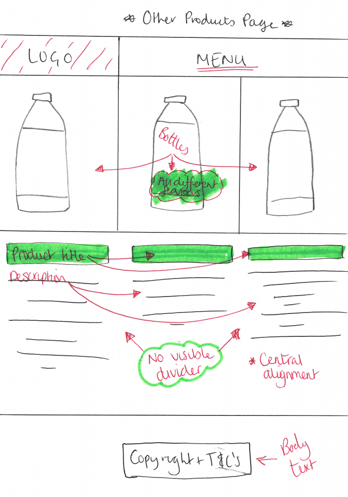
Above is another plan for my website, in the original plan denoting the intended layout, the ‘other Products’ page is the first interactive element within the grid that the audience can interact with. The aim of this page is to show all of the different products available to the audience and also give extra information through the product description below. The webpage adheres to all of the header and footer properties from the main page, however the contents in-between change.
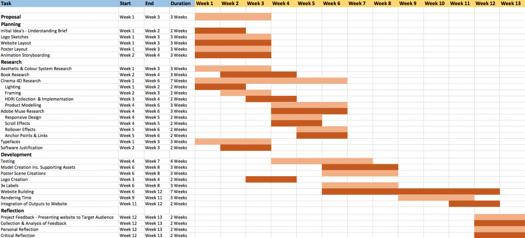
Gantt Chart
This is my gantt chart for my project, it shows all of the tasks that I need to complete with relation to when they need to be started and completed by, this is shown in two ways: verbally as you can see on the left and visually as you can see on the right with the horizontal coloured bars. I have arranged each task in a specific order so that I start the most basic ones first, further allowing me to progress and develop into the more complex tasks which will built up my knowledge for the different softwares/plug-ins I intend to use.
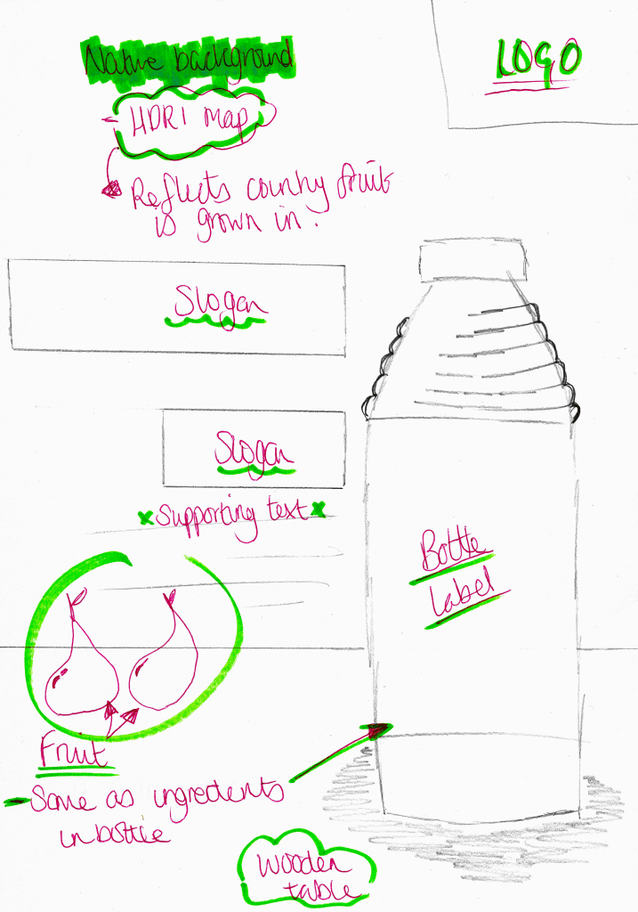
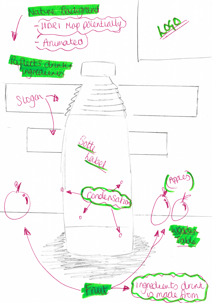
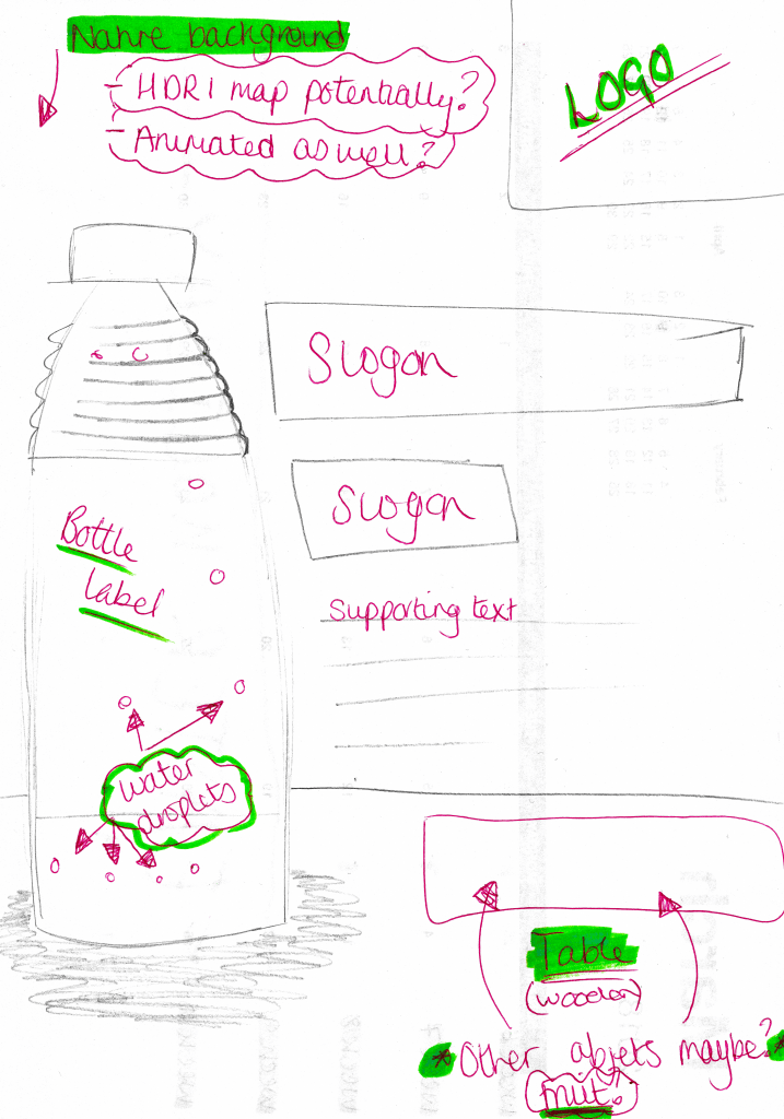
Poster Design Plan
Above are the three poster designs I have created for my products, each one features a unique layout that fits in with the house style of the company. Within the three designs, the table object is kept in the same place and the only thing that differs from one design to another is the type of fruits on it, this is meant to represent all of the different ingredients that make up the juice drink. Furthermore, as the fruits change from one design to another, so does the background, this is meant to represent the different countries in which the different fruit is grown in. The subtle difference is meant to suggest that the company engages with local communities all around the world which further suggests different positive messages about the company. Additionally, these backgrounds can be further developed as the online versions of the posters can have animated backgrounds, this will make them to more visually interesting as there is some sort of subtle movement occurring, whereas the print-based posters will have static backgrounds. And lastly, alignments of the bottles within each poster is also meant to make it more visually interesting both individually and as a group, as the same table is planned to be used throughout all three posters when they are placed side-by-side they supposed to produce a panoramic view or a triptych image.
