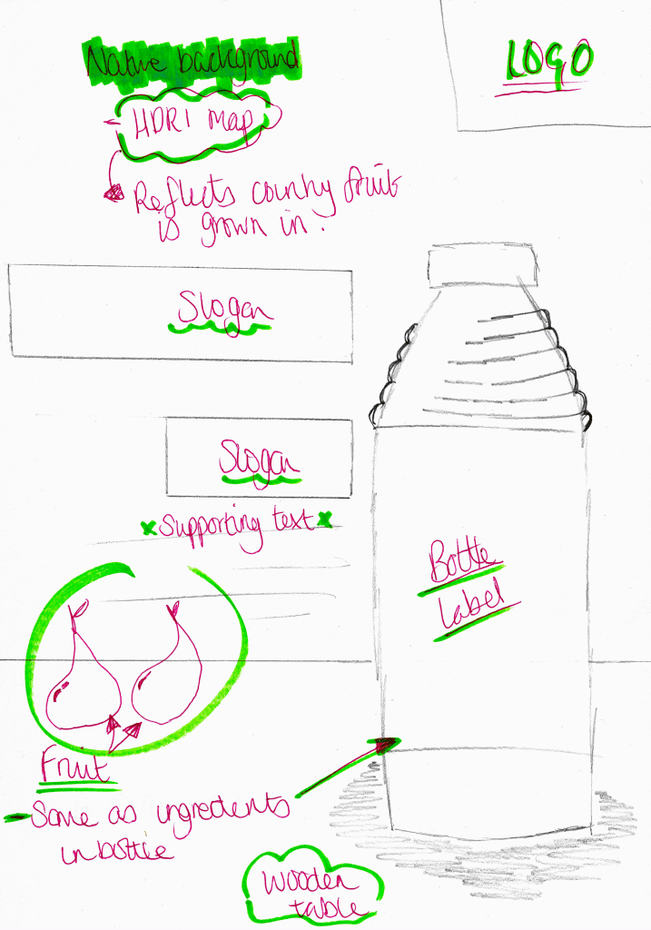
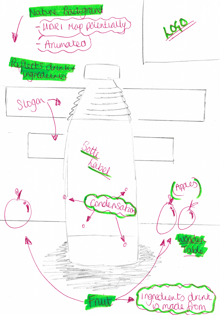
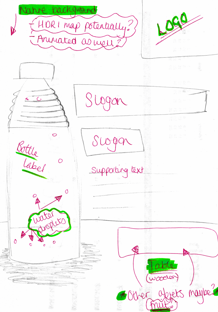
Above are the three poster designs I have created for my products, each one features a unique layout that fits in with the house style of the company. Within the three designs, the table object is kept in the same place and the only thing that differs from one design to another is the type of fruits on it, this is meant to represent all of the different ingredients that make up the juice drink. Furthermore, as the fruits change from one design to another, so does the background, this is meant to represent the different countries in which the different fruit is grown in. The subtle difference is meant to suggest that the company engages with local communities all around the world which further suggests different positive messages about the company. Additionally, these backgrounds can be further developed as the online versions of the posters can have animated backgrounds, this will make them to more visually interesting as there is some sort of subtle movement occurring, whereas the print-based posters will have static backgrounds. And lastly, alignments of the bottles within each poster is also meant to make it more visually interesting both individually and as a group, as the same table is planned to be used throughout all three posters when they are placed side-by-side they supposed to produce a panoramic view or a triptych image.


