Overall, this project has been an enjoyable experience that has presented challenge and obstacles to overcome. I feel that using Cinema 4D and Adobe Muse this semester has been greatly beneficial, as I have been able to learn a lot of new techniques and also had the opportunity to implement prior skills learned from previous semesters. I feel that pushing myself into the Photorealistic avenue with this project has further sparked an interest to pursue this after education, I enjoy achieving a high-quality standard with my work and also tackling the challenges when this standard is not met.
Whilst taking this journey, I encountered a lot of difficulties. As my project was so unique, it was sometimes very difficult to find direct solutions to my problems, and as a result, I ended up conducting a lot of tests outside the main project in order to try and solve them. Additionally, not all of my problems where technical, some of them were subjective as I would work on one aspect of my project for such a long time where it would begin to blur together, for example, spending hours making small changes to the liquid colours inside the bottle to try and make it look aesthetically pleasing.
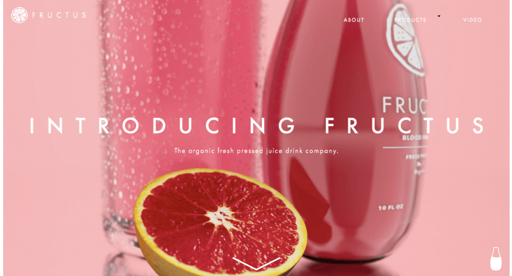
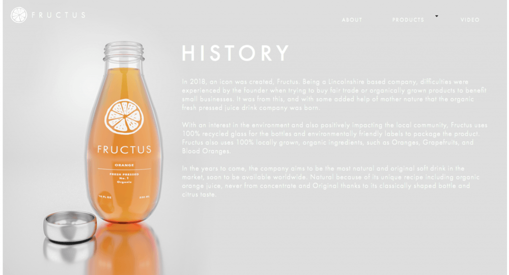
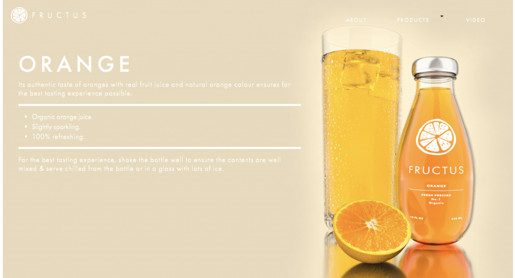
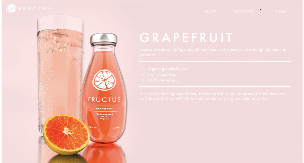
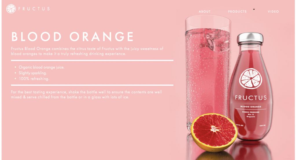
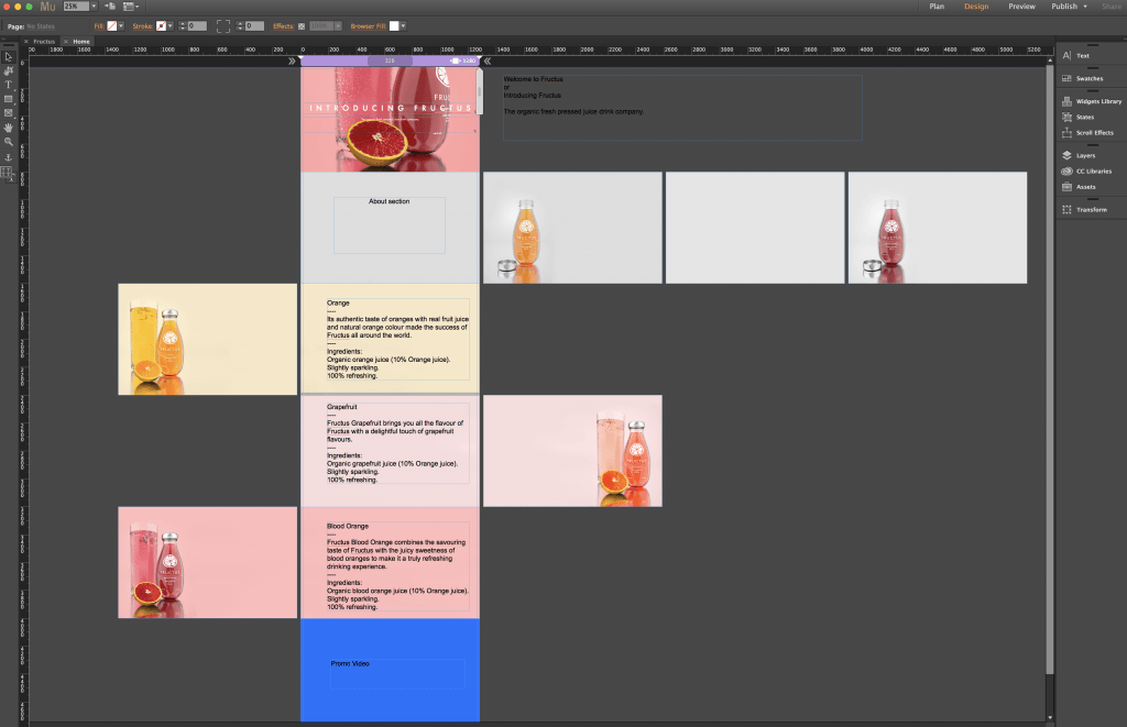
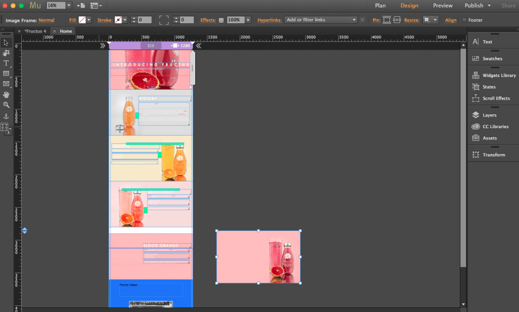
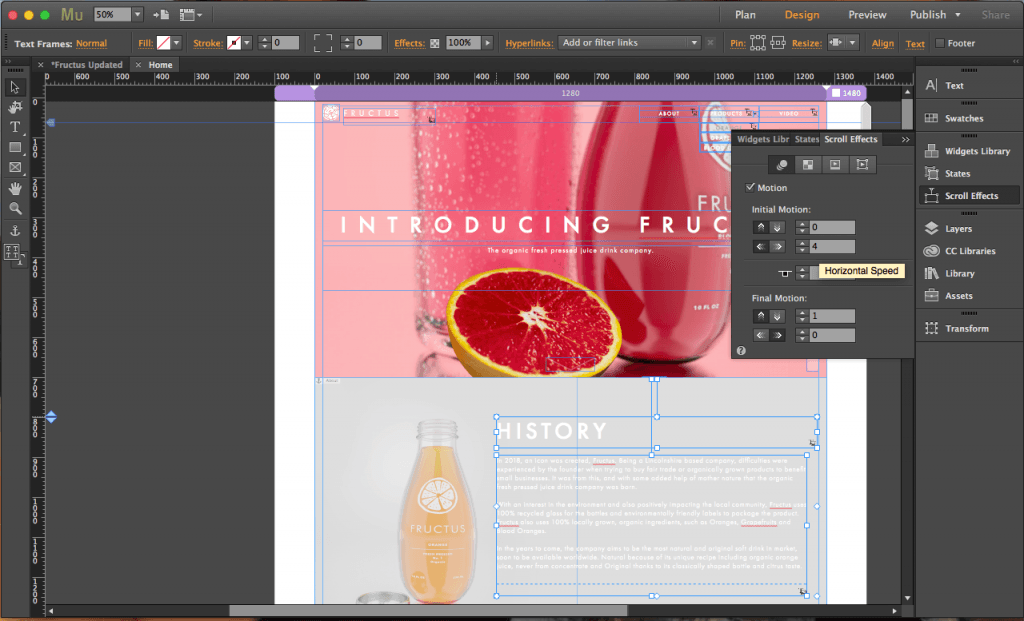
One of the most challenging problems I faced was finding a new background environment for the product. Discussed in a blog post, when I first created my project I wanted it to be placed into a scene where it best represented the ingredients origin, however, after discovering that this wasn’t a viable option anymore, I had to search for something different. Fortunately, I had watched a tutorial online that had shown how to make a studio scene with a reflective floor, and the aesthetics that it achieved were very appealing, so I decided to create my own variant of it which solved my issue. In addition, I also experienced similar aesthetic problems in my website creation. Because the white text colour used on the label of the product, I had to make a lot of adjustments to the background images on the website. This was to ensure that there was enough contrast between the two visual elements to make it information legible, as theres no point in having text on there if it cant be read.
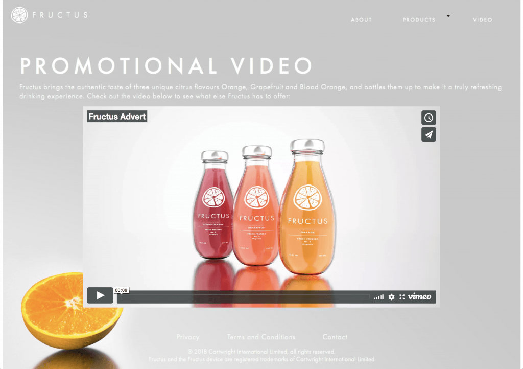
When approaching projects like this in the future I would allow myself more time to research and experiment with realistic or PBR materials. In my Gantt chart, I highly underestimated the amount of time I would need to research all of the different elements that would form the basis of my models, and because if this, I felt like it could have been much better. In addition, I feel that the composition of my renders could have also been improved from additional time. This is, in my opinion extremely noticeable in the three main renders for the different flavours, as the overall image doesn’t have that balanced aesthetic that I would like, however, this is just a small criticism as it still achieves photorealism which was desired from the beginning.
