Label Designs

From my previous post denoting my label plan, I have now gone and made the label based on that plan whilst also producing an alternative as a backup. Here are the two variants:

Logo Designs 2-17 Logo Designs 2-13

The overall design of the first label is very similar to the plan I sketched out. I had to alter the spacing slightly between the logo, name and details as I felt that if the spaces weren’t equal then it would look visually displeasing. In addition, I also experimented with the different weights of the text to add diversity and also to put more emphasis of key parts in the label, such as ‘Fresh Pressed Juice’ & ‘No. 1’.

For the second design, I took a completely different layout approach to the logo, by putting the name and image in the diamond banner, I thought it would make it stand out from the crowd as many of the other competitors don’t do this. However, After completing it, I realised that it doesn’t show the fruit image at a large enough scale – making it look like a white blob. In addition, I feel that the diamond shape is too wide and would stretch too far around the bottle, meaning that the audience wouldn’t be able to see the full label from a static position, they would have to rotate it fully to see the full thing.

As discussed in the previous post with the plan, the black background used within the two label designs above will not be used when applied to the bottle itself inside of c4d. As the background of the labels will actually be transparent, the use of the black background in this instance allows the white details to become visible.

From evaluating each design, I decided to continue with the first one as it was the strongest. After reaching this decision, I then further decided to create other variations of this design, experimenting with Typefaces, Image scales and Text sizes.
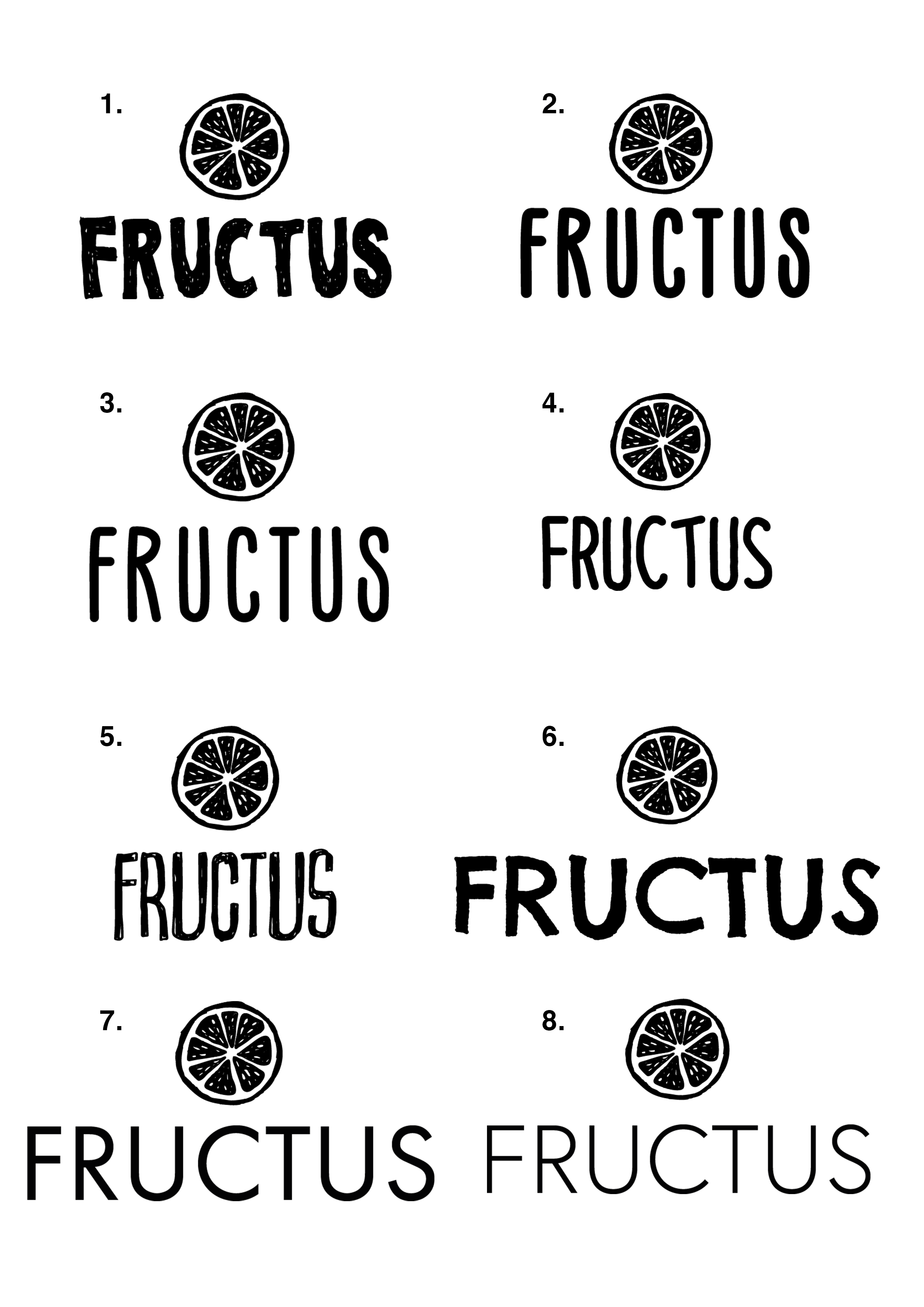
Other Variations: 

Logo Designs 2-14 Logo Designs 2-15 Logo Designs 2-16

Here are some of the other variations that I have created, A lot of them experiment with different sized typefaces as well as different weights. In addition, I have also experimented with proportions in terms of spacing between text & image objects as well as sizing of images – as you can see throughout, the size of the fruit has been changed consistently to create a balance between the Name of the product and also the image.

Furthermore, I have also change the size of the descriptive text under the essential name and image so that it will be more visible and readable when applied to the bottle.
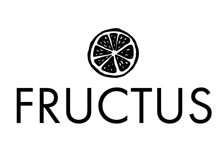
Final:

Logo Designs 2-18

This is the final form of the label, I feel that it is the strong one I have produced, this is mainly down to its utilisation of space – the spacing between all of the sections is equal, producing a nice flow and additionally, it also has the right balance between the name and the image – one is not more dominant than the other.

Liquid Creation

After my last modelling post where I showed all of the different bottle designs, I wanted to take these further by creating the liquid that goes inside of them. Using my research from the prior posts, I started to create the liquid and also documented my process in the video below.

The overall the results turned out really well, the bottle with the liquid looks really good especially when the liquid inside has some transparency (not shown in the video) as it looks even more realistic. Prior to this video, I had completed a test to make sure my processes worked, enabling me to successfully create it on the screen recording – I had found out that it was best to make the liquid object inside of the bottle slightly smaller so that the inside spline of the bottle and the outer spline of the liquid didn’t intersect – not completing this produced some visual defects on the render where the liquid visible popped through the glass. However, from the video above, you can see that I included this step within my process and didn’t encounter this problem.

Final Renders:

These are all of the renders of all of the bottles, I wanted to see what they all looked like with liquid inside of them before choosing the final bottle, I feel that showing them with something inside will drastically change the way they appear and also the way in which light interacts with the liquid.

Bottle&Fluids

These turned out really well and further support my statement of making some of the bottles look more aesthetically pleasing – especially bottles 1, 3, 5 and 6. I feel that these will be the ones which I continue forward with my testing with the labels and caps (and then from this, I will choose one of four for the final bottle for my product).

Whats Next:

Next, I will start to create caps for all of the models, in addition to adding the labels to them.

Logo Update

After posting my different logo designs on social media for feedback, the general consensus from the group was that the third logo or the half cut orange was the most preferred. I wasn’t particularly keen on it at the start, however, after leaving it for a couple of days it grew on me. From this point, I then decided to try and experiment with the name of the company under it – as Fructus isn’t a well-known brand, having just the logo on its own wouldn’t be a good idea, the potential consumers of the product would see the logo and wouldn’t understand who makes it. The key to logo design from a new company is consistency – having a logo image that changes every time with a new product wouldn’t allow for the consumers/audiences to become familiarised with the brand and image – they wouldn’t be able to associate the two together making it less memorable. Because of this, I decided to stick with the half-cut orange logo and then further experiment with different typefaces, which can be seen below:

logos

Overall, the use of the sketched logo style with hand-written typeface, used in examples 1 – 6 gives an overall feeling of inexperience. The overuse of the cartoon-like theme makes it seem like a young child made them and seems to target itself at a lower demographic as a result – even if the graphic styles of the two elements match it gives me the sense of cheapness and again put together in a non-caring way without quality. Oppositely, the uses of a sans-serif typeface, like in 7 & 8 accompanied by the sketched logo style gives a harmonised feeling, much like Ying and Yang but with its own fun twist – the two different styles co-ordinate together and create a more rounded brand image that can be aimed at a large demographic.

Final:

Lo-19

As a result of my analysis of the logos, I have deiced to use logo number 7 for the reasons listed above. In addition to those, I feel that the bold text in No.7 will be easier to read when applied to the bottle in c4d, I feel that the weight of the text in No.8 is just a little bit too light for it to be easily legible, which is a major factor when designing a product label – it has to effectively communicate its information to the consumer/audience.

Final Models

After the last modelling post, I set myself the task of finishing the bottle models. After completing the rest of the splines in Adobe Illustrator, I then saved it and imported it into c4d – from then I completed the same process I went through when completing the first model in the previous post. These are the final results of the models:

Models

Overall, I feel these turned out really well. The realism of these is pretty good however, I feel there still room for improvement within the material settings and lighting to make them look even better – this could be the increase of the blurriness of the glass or the use of a studio HDRI that would better illuminate the models creating more attractive reflections.

Whats Next:

Now that the models were successfully created, I can now try and make the fluid object and material to go inside of the bottle, this will give a better indication as to how the final models will look. In addition, I can also now post these bottles onto social media to find out which one the target audience prefers – enabling me to get feedback from my target demographic.

Modelling

After conducting my modelling research post using a tutorial from YouTube, I set about putting my newly learnt knowledge into practice by creating a bottle. The development video below denotes my commentary and also the steps in which I took in order to get the bottle from a simple spline in Adobe Illustrator to a full 3D model in Cinema 4D with textures. Here it is:

In the video, I demonstrated my abilities in drawing the profile of the bottle using a reference image, then exploring as an Illustrator 8 file and then importing it to c4d. Once in c4d, I realised that the different splines I had drawn (I had created two of them) had been imported as two different elements which were incredibly useful to know as I can now create all of the spline profiles in one document and then import them all across. After this, I then put the spline into a Lathe NURBS to turn the spline into a 3D object and created the bottle – what I didn’t know was when I imported the spline into c4d was that it wasn’t centred on the zero mark for the X, Y and Z axis. This meant that the Lathe NURBS was taking the splines position and revolving the shape around the zero point, thus creating a larger and wide object.

Final Render: 

Bottle Render

The final render has turned out well and has allowed me to deem it successful. With the added texture, the object looks really good – even if it might be lacking the thread for the cap at the top of the bottle. I feel that the way I closed the bottom of the bottle up was average, however, you can still see a defect where it’s not fully joined – this will need to be addressed. I feel that the bottom of the bottle could do with being less rounded, for my personal opinion I would like it to be more squared as I think that this would look more aesthetically pleasing.

Whats Next:

Now that this render was successful, I can continue on with the rest of the different shaped objects and create more 3D bottles with different shapes. In addition, I can also test out how the bottles will look like fluids in them – this will further test my abilities as I have never created a liquid texture before and especially ones with pulp in such as all the materials present in the typical juice drink.