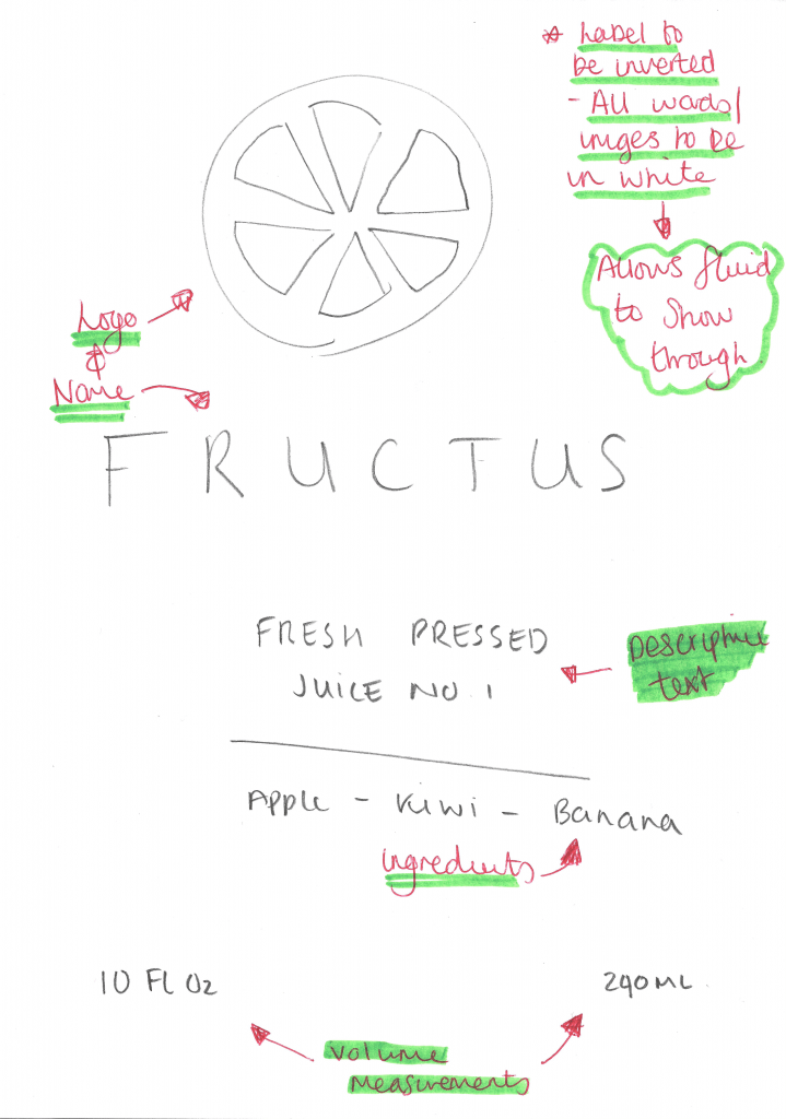
This is the main generic label for my product, although I have 3 different products I aim to produce, I would all like them to follow this generic style. I wanted the label to reflect the minimalist theme that was going to be engrained in my company from the start, this has informed most of my decision making when planning the label as I didn’t want to incorporate too many visual & text elements which would subvert the minimalist convention. The label itself will have no background, this will allow for the colour of the liquid inside of the bottle to show through, and contrast against the text which will be in white – this contrast will create a nice aesthetic feel to the product as white is often associated with clarity and goodness which will then be reinforced through the audience being able to visually see the organic contents of the bottle.
