Label Plan

final label Sketches

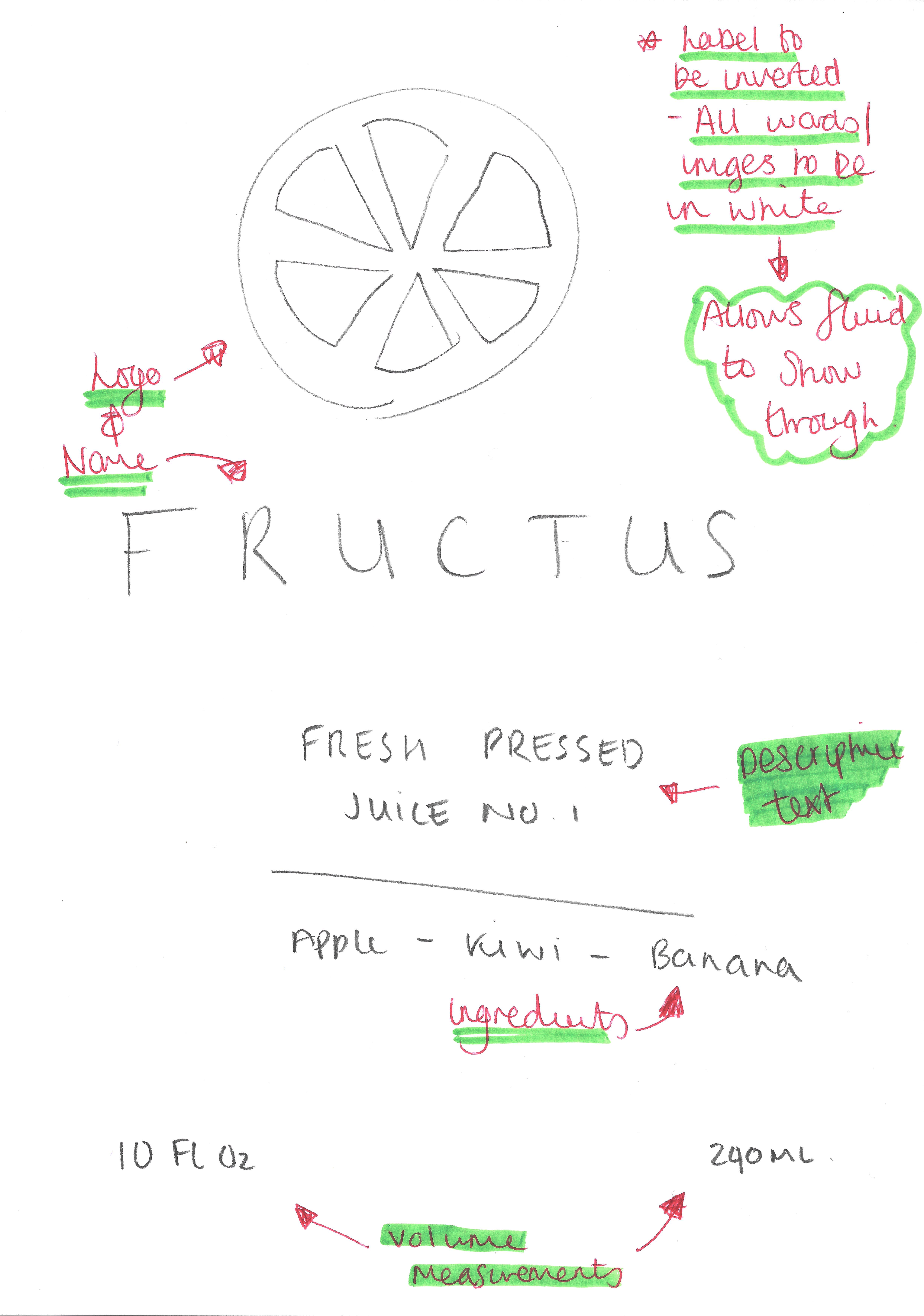
This is the main generic label for my product, although I have 3 different products I aim to produce, I would all like them to follow this generic style. I wanted the label to reflect the minimalist theme that was going to be engrained in my company from the start, this has informed most of my decision making when planning the label as I didn’t want to incorporate too many visual & text elements which would subvert the minimalist convention. The label itself will have no background, this will allow for the colour of the liquid inside of the bottle to show through, and contrast against the text which will be in white – this contrast will create a nice aesthetic feel to the product as white is often associated with clarity and goodness which will then be reinforced through the audience being able to visually see the organic contents of the bottle.

Logo Development

Time-lapse:

Below is a time-lapse of my logo development showing the complete process from start to finish of all of my logos I made. When creating all of the different variants of all of the logos, I made sure to include a wide range of artistic styles to reflected the ethos behind the company (edgy and organic) – this was to fully cater for the target demographics personal tastes in artistic styles. Additionally, Some of the logos that are produced have also been displayed in white on black and also black on white – This is to fully reflect how logos looking different circumstances and also to give the audience a better view as to how it might look into different colour variations.

Final Logo’s:

Below are the finals logos produced, from the time-lapse above you can see how some of these were made – Some of the logos were quite difficult to make as they were very intricate, e.g. Logo #1 and oppositely similar logos were very simplistic and easy to make, e.g. Logo #9. Overall I feel very happy with how all of the logos turned out and I feel that logos #3 & #5 are my favourite, however I feel that I will have to take into consideration the target demographics opinion when finalising my decision on which logo to select from the company.

Artboard 1 copy 3 Artboard 1 copy 4

After producing all these logos, I’m going to post these to social media for my peers & target demographic to give feedback on – This will not only help me to communicate to my target demographic, It will also enable me to get some feedback from them and understand how they think about images and how they relate back to the brand.