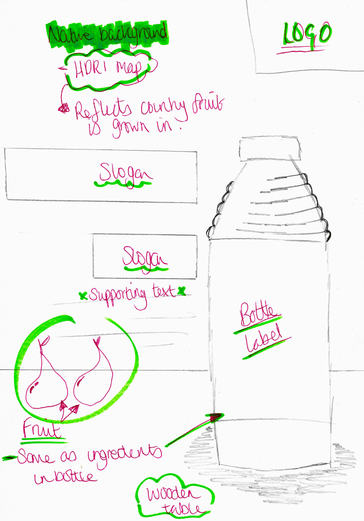
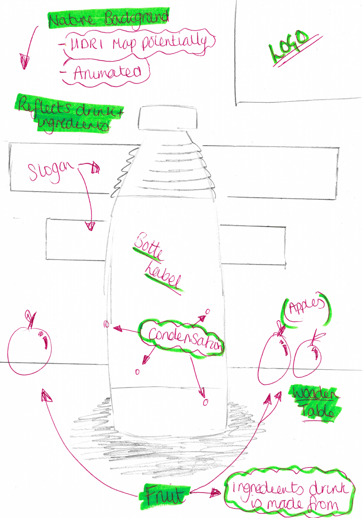
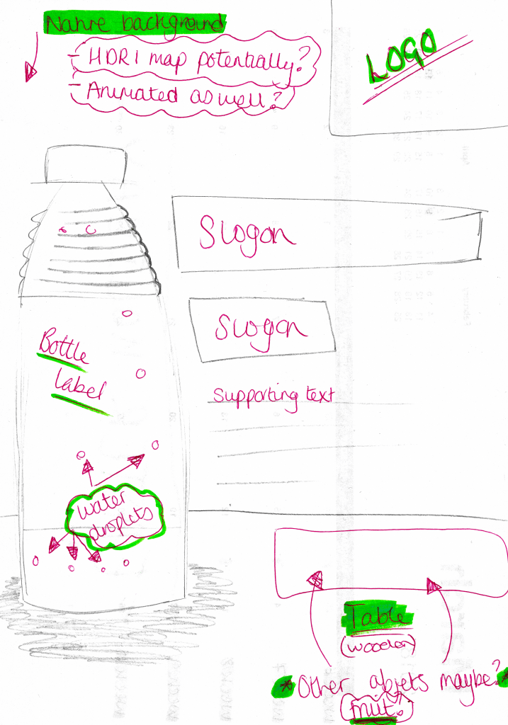
Above are the three poster designs I have created for my products, each one features a unique layout that fits in with the house style of the company. Within the three designs, the table object is kept in the same place and the only thing that differs from one design to another is the type of fruits on it, this is meant to represent all of the different ingredients that make up the juice drink. Furthermore, as the fruits change from one design to another, so does the background, this is meant to represent the different countries in which the different fruit is grown in. The subtle difference is meant to suggest that the company engages with local communities all around the world which further suggests different positive messages about the company. Additionally, these backgrounds can be further developed as the online versions of the posters can have animated backgrounds, this will make them to more visually interesting as there is some sort of subtle movement occurring, whereas the print-based posters will have static backgrounds. And lastly, alignments of the bottles within each poster is also meant to make it more visually interesting both individually and as a group, as the same table is planned to be used throughout all three posters when they are placed side-by-side they supposed to produce a panoramic view or a triptych image.
Initial Idea’s #2
After making my decision to change ideas, I have been thinking about different technologies and software which I could potentially use. After completing my last semester’s project, utilising Cinema 4D I wanted to take a more design-oriented path for this semester. When discussing my problems with a tutor, it was suggested that I could potentially create a Company and utilise my design skills to create a logo and packaging labels, as well as utilising my learn skills from last semester to produced 3D models of this product and to also create a 3D animation used for advertisement.
This project is going to be very exciting as it allows me to create work which will come together at the end to produce an aesthetically pleasing media product. To contextualise all of the outputs which I intend to create, I will construct a website utilising similar design themes making all of the outputs coherent. The project will test abilities and knowledge of software’s, such as Adobe Muse, Adobe Illustrator and Cinema 4D, as well as my abilities in transferring my work into the other software.
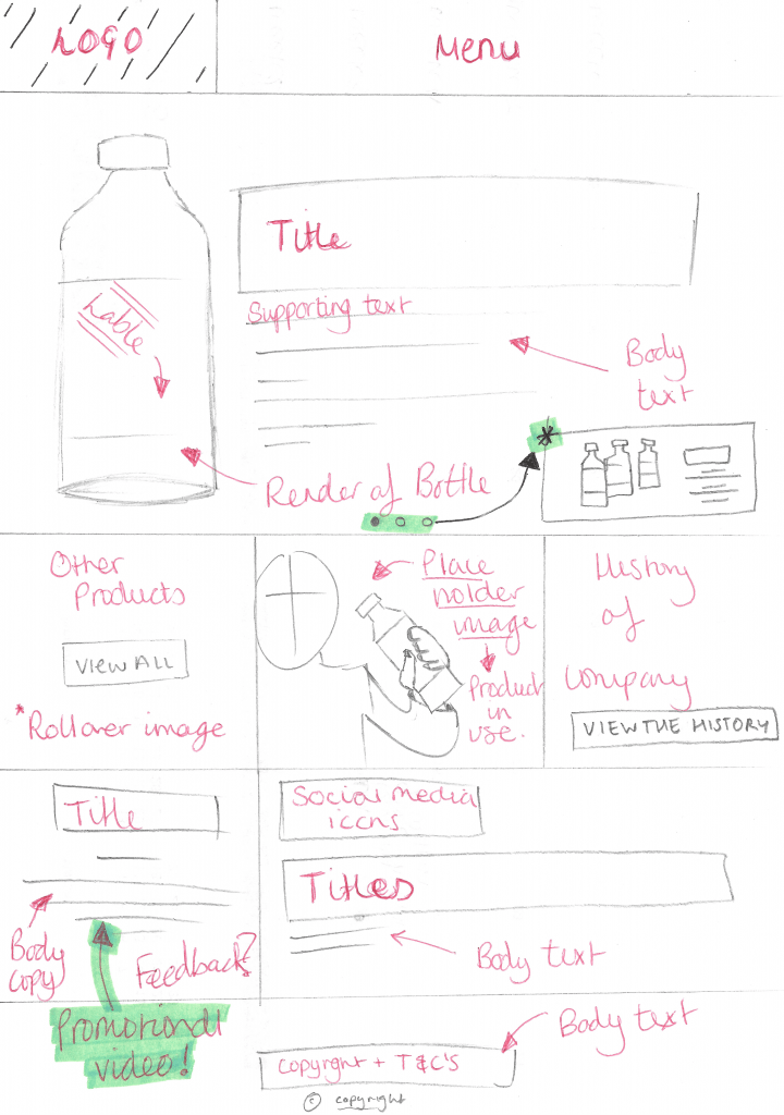
Website Plan #1 Main Page
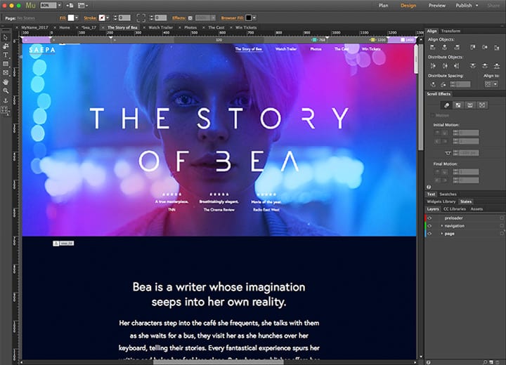
Above is a plan for my website. Taking vast amounts of inspiration from my moodboard and also adhering to generic layout conventions used with all of the images, I have created a rough plan of how I will structure all of the elements:
Header – The use of a header or menu for my website will be essential for the audience to navigate to the information that they need to access, however, it is undecided yet whether it will be static or adaptive. Secondly,
Banner Image – The use of a banner image is a very common and regularly used convention, seen within my moodboard it gives the opportunity to the audience to see the product and what it looks like. I will also follow this convention by showing a rendered version of my product which will also be accompanied by support text to aid in promotion. As well, I would also like the image to change every 5-10 seconds potentially showing the other products that the company has to offer.
Grid – The use of a grid structure is another convention that is used by some of the websites in my moodboard. I will stick a very rigid grid structure, mainly because I feel it organises the websites in an aesthetically pleasing way. Within the image above, I will have separate sections for the history, other products and promotional videos (as well as others) for the audience to access, however, these still need to be planned.
Footer – Commonly, the bottom of the website is reserved for the Term’s & Conditions of the site and also the fine print for usage. I will adhere to this convention, stating T&C’s, copyright and other legal information that would be used on a normal website.
Branding Moodboard – Logo
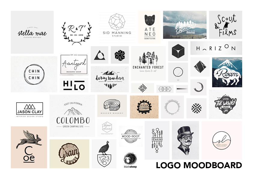 Above is a collection of minimalist logo’s that incorporate an image element as well as a calligraphy typeface together to form a combination logo. I would like this logo to look aesthetically pleasing on black on white and white on black so that when it is applied to my packaging no matter what colour the liquid is inside it will work effectively. The use of text and an icon is formerly known as a combination mark logo, this will help to establish some ideologies behind the company when the audience takes a glance at the packaging or the website. The complexity of the icon will have to vary depending on what scale it is at, is the icon is at a small-scale, for example on the packaging the details within the icon will have to be reduced so that it will be clear. Furthermore, this will be the opposite of when the icon is that a larger scale, for example on the website where more detail can be added.
