Software Research

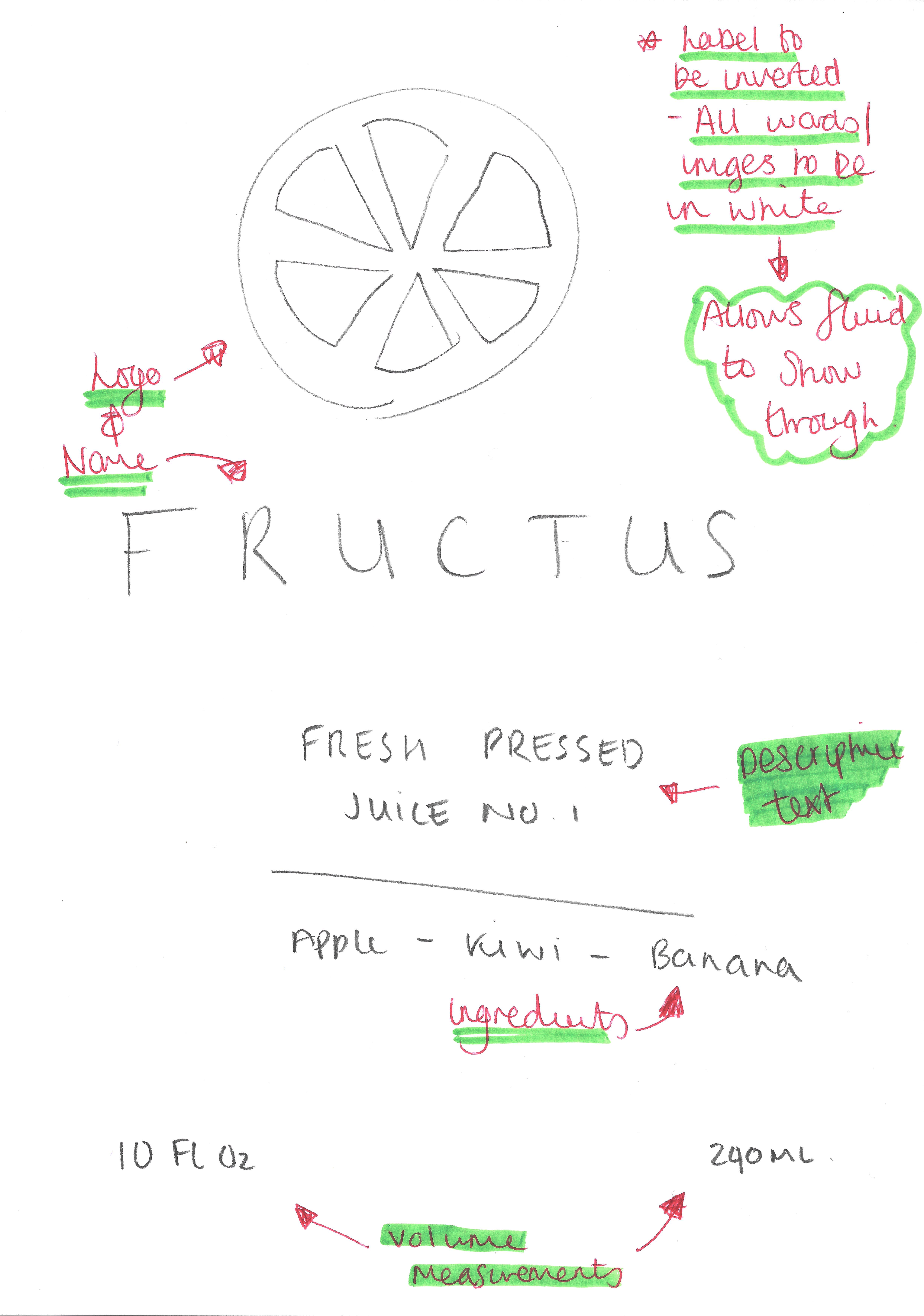
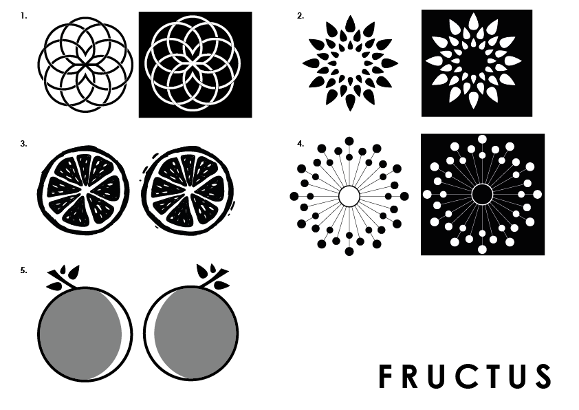
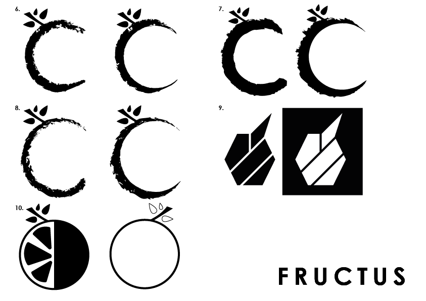
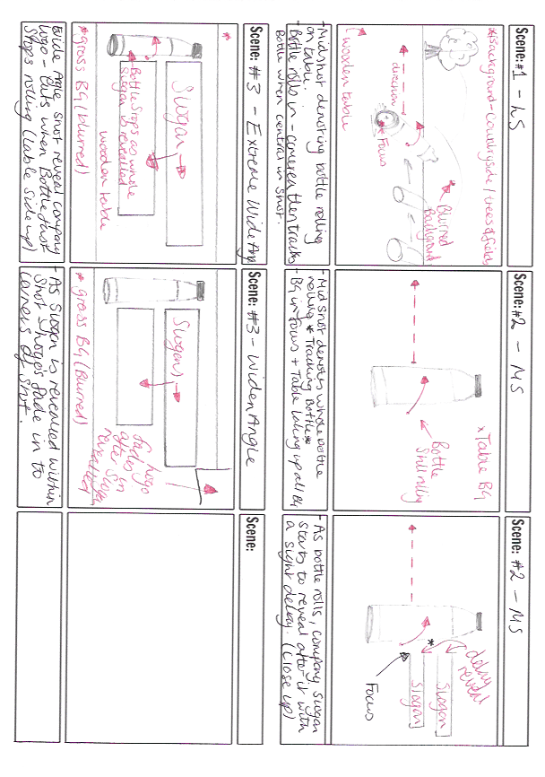
Within my Learning Agreement, I stated that I was going to use Cinema 4D and Adobe Muse in order to create all of the different forms for my concept company.  To support this decision, I am going to conduct some research into the different types of software that is available today, looking specifically at What they do or What they are most commonly used for within industry, What platforms they are available on, Cost of the software and Accessibility to me as a student.

Cinema 4D

Within my last semester software post, I concluded that “Cinema 4D is a 3D Modelling, Rendering and Animation software that is most commonly used within the television and advertising industry”, making it perfect for the task ahead as I was going to model the products for the company. Furthermore, due to its long-standing presence in the 3D software space, “it has developed a powerful set of MoGraph tools that can make real-world motion graphics by enabling cloning, the adding of effects and easy motion creation of objects” which would further benefit me in the modelling stages (Andrew Cartwright, 2017).

Another major factor contributing to use of this software in my project is a large amount of knowledge I have in it. Mainly due to last semesters project, I have developed my skills within this software drastically as I had to create a project without the use of a tutorial to follow exclusively or an help from an expert. This is a significant factor in my decision as having to learn a new software from scratch would be very challenging – especially due to the strand I have chosen where 70% of my mark is based on the final media product – this would leave no margin for error.

And lastly, another contributing factor to my decision of using Cinema 4D is that I already have the student version of the software. As stated on last semesters post “Cinema 4D has a limited accessibility as I can apply for a 30 day free trial, but as a student I am able to apply for a free and complete student license of the software which makes it a more viable option” (Andrew Cartwright, 2017).

maxresdefault

Adobe Muse

Adobe Muse provides an easy way to create websites. With the aid of prior knowledge in the software and Muse’s design-oriented creation approach, making websites is incredibly easy to do – because of this factor, it makes it highly desirable to choose it as I will be able to create a highly functional website packed with functional aspects which would increase the quality.

Another factor in my decision to choosing Muse is my prior knowledge. From using the software in past projects such as my Level 2 assignment, I have developed a wide set of skills within the software of being able to create aesthetically pleasing websites with attractive rollover buttons that are highly functional. Because of this, when conducting research I won’t have to start from the ground up, I will be able to build straight onto the technical skills rather than start from the basics, which would further provide a challenge.

And lastly, another contributing factor to my decision of using Adobe Muse is its accessibility. Due being a student at the University of Lincoln I am eligible for free an Adobe Creative Cloud package, this grants access to myself to all of Adobe’ softwares – specifically Muse – which will enable me to create it.

download

Conclusion

To conclude, using both Cinema 4D and Adobe Muse would be the best options for me in producing the highest quality work possible (because of my strand choice). I already have a high amount of pre-existing knowledge within these software from successfully completing past projects. In addition, using this software would allow for increased workflow as Cinema 4D has convergence capabilities with other Adobe programs such as After Effects, which I would need to use to bring the renders together. Furthermore, because Muse is apart of the Adobe family, I can utilise other Adobe applications such as Illustrator or Photoshop to help create assets which would further make the creation process of the website easier. Another supporting factor in my decision is the accessibility, because of my student status I am eligible for free an Adobe Creative Cloud package which grants me access to all of Adobe’ softwares and further allowing me to get a free student license to Cinema 4D R19 – because of this, and due to the fact that I already have both sets of software it makes clear indication to selecting them.

References

Andrew Cartwright (2017) Media Project One: Software Research [blog]. 6 October. Available from http://andycartwrightprojects.blogs.lincoln.ac.uk/2017/10/05/software-research/  [accessed 19 February 2018].

Label Plan

final label Sketches

This is the main generic label for my product, although I have 3 different products I aim to produce, I would all like them to follow this generic style. I wanted the label to reflect the minimalist theme that was going to be engrained in my company from the start, this has informed most of my decision making when planning the label as I didn’t want to incorporate too many visual & text elements which would subvert the minimalist convention. The label itself will have no background, this will allow for the colour of the liquid inside of the bottle to show through, and contrast against the text which will be in white – this contrast will create a nice aesthetic feel to the product as white is often associated with clarity and goodness which will then be reinforced through the audience being able to visually see the organic contents of the bottle.

Logo Development

Time-lapse:

Below is a time-lapse of my logo development showing the complete process from start to finish of all of my logos I made. When creating all of the different variants of all of the logos, I made sure to include a wide range of artistic styles to reflected the ethos behind the company (edgy and organic) – this was to fully cater for the target demographics personal tastes in artistic styles. Additionally, Some of the logos that are produced have also been displayed in white on black and also black on white – This is to fully reflect how logos looking different circumstances and also to give the audience a better view as to how it might look into different colour variations.

Final Logo’s:

Below are the finals logos produced, from the time-lapse above you can see how some of these were made – Some of the logos were quite difficult to make as they were very intricate, e.g. Logo #1 and oppositely similar logos were very simplistic and easy to make, e.g. Logo #9. Overall I feel very happy with how all of the logos turned out and I feel that logos #3 & #5 are my favourite, however I feel that I will have to take into consideration the target demographics opinion when finalising my decision on which logo to select from the company.

Artboard 1 copy 3 Artboard 1 copy 4

After producing all these logos, I’m going to post these to social media for my peers & target demographic to give feedback on – This will not only help me to communicate to my target demographic, It will also enable me to get some feedback from them and understand how they think about images and how they relate back to the brand.

Logo Sketches

Logo SketchesLogo Sketches 2


Here are 7 different sketches for my logo design. I wanted to incorporate a wide variety of  different designs that reflected the ethos behind the company (edgy and organic), and also explore different art styles that might suit. I feel that no. 2, 3 and 6 all follow convention logo design for fruit juice companies and then all stereotypically incorporate a fruit object within their logo – this isn’t necessarily a negative aspect towards logo design however I would like the company to standout against the competition in terms of logo design. Opposite lead to this, no. 4, 5 and 7 subvert conventional logo designs for fruit juice companies which could be a good way to standout. My next steps within the logo process will be to go into Adobe Illustrator and actually start to create these designs, to which I can then post these designs on social media to get target audience or demographic feedback.

Animation Storyboard

Animation Storyboard

Above is a storyboard for my animation which will form the promotional video for the company. The intended length for the animation is 10 seconds and aims to reveal the company products whilst familiarising the audience with the slogan of the company as well as the logo. The animation starts with a long shot of the bottle rolling into frame on light wood desk, when the bottle reaches the centre of the frame, the camera then begins to track alongside. After this 2 second scene, the animation will then cut to an aerial shot where the main focus will be on the bottle continually rolling. The light wood table will fill the frame of the shot and after 1 second, the bottle will reveal the company slogan – this will be too large in the frame to fully understand, however, it will contrast highly against the light wood of the table drawing the audiences eye. After this, another aerial shot will be used to reveal the text in an wide angle – just after this cut has occurred, the bottle will stop rolling label side up and will align closely to the company slogan which will have left alignment. The framing of this wide angle aerial shot will allow the audience to see the table in full horizontally, but will show the grass floor at the top and the bottom of the frame. The animation will be set in a countryside environment, where a tree can be seen in the foreground just behind the table and fields can be seen in the background. This gives the audience a sense of where the ingredients used within the product are grown, and will also help to reinforce the notion that everything in organically grown without chemicals or genetic modifiers.