Scene Dressing

Since my last post, I set myself the task of integrating the glass models into the main project file. Within the video below you can see this process taking place, as well as a couple renders to show what the supporting assets look like with the main product.

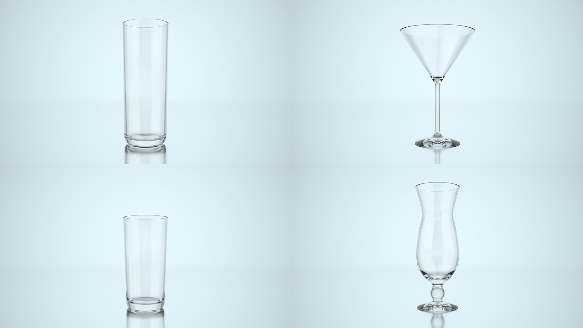
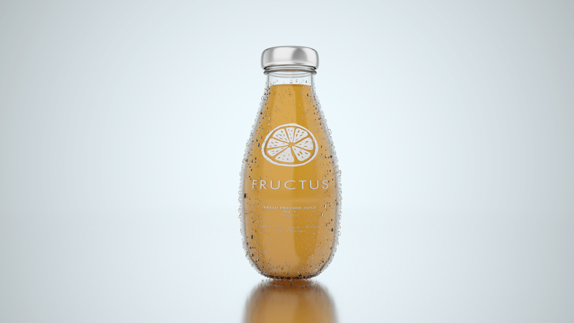
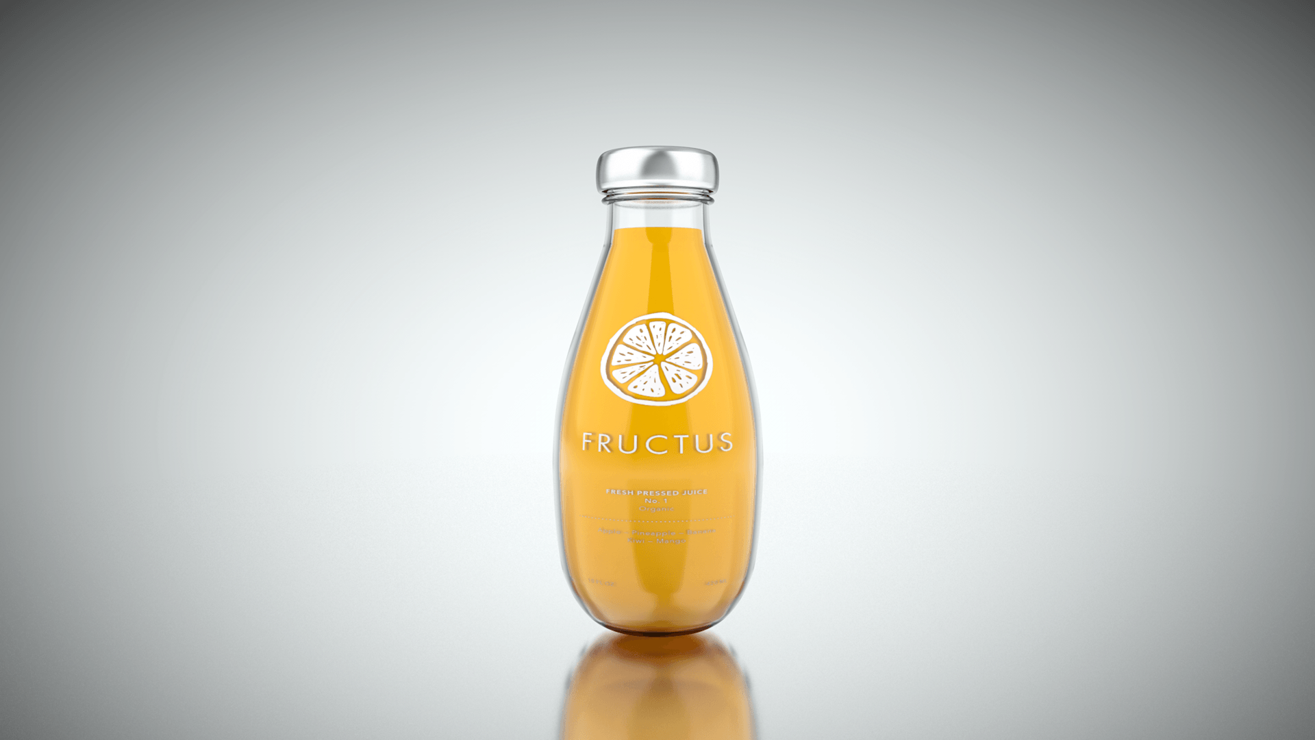
Within the time-lapse, I demonstrated my workflow by importing the glass models into the main project file and then altering the scale and alignment of them to create a balanced shot through the camera. I then started to create the liquid objects, by using the same method as the Fructus bottle, I copied the inside profile and put this into a Lathe NURBS to create a 3D object. I found this process incredibly easy as I had done it multiple times before with the bottle, the only difficulty I had was creating a dilute version of the liquid texture that looked good. I spent a lot of time altering the colours, absorption distance and strength to make it look realistic, and from the final renders below I feel like I did a good job.

Renders:

Glasses&product

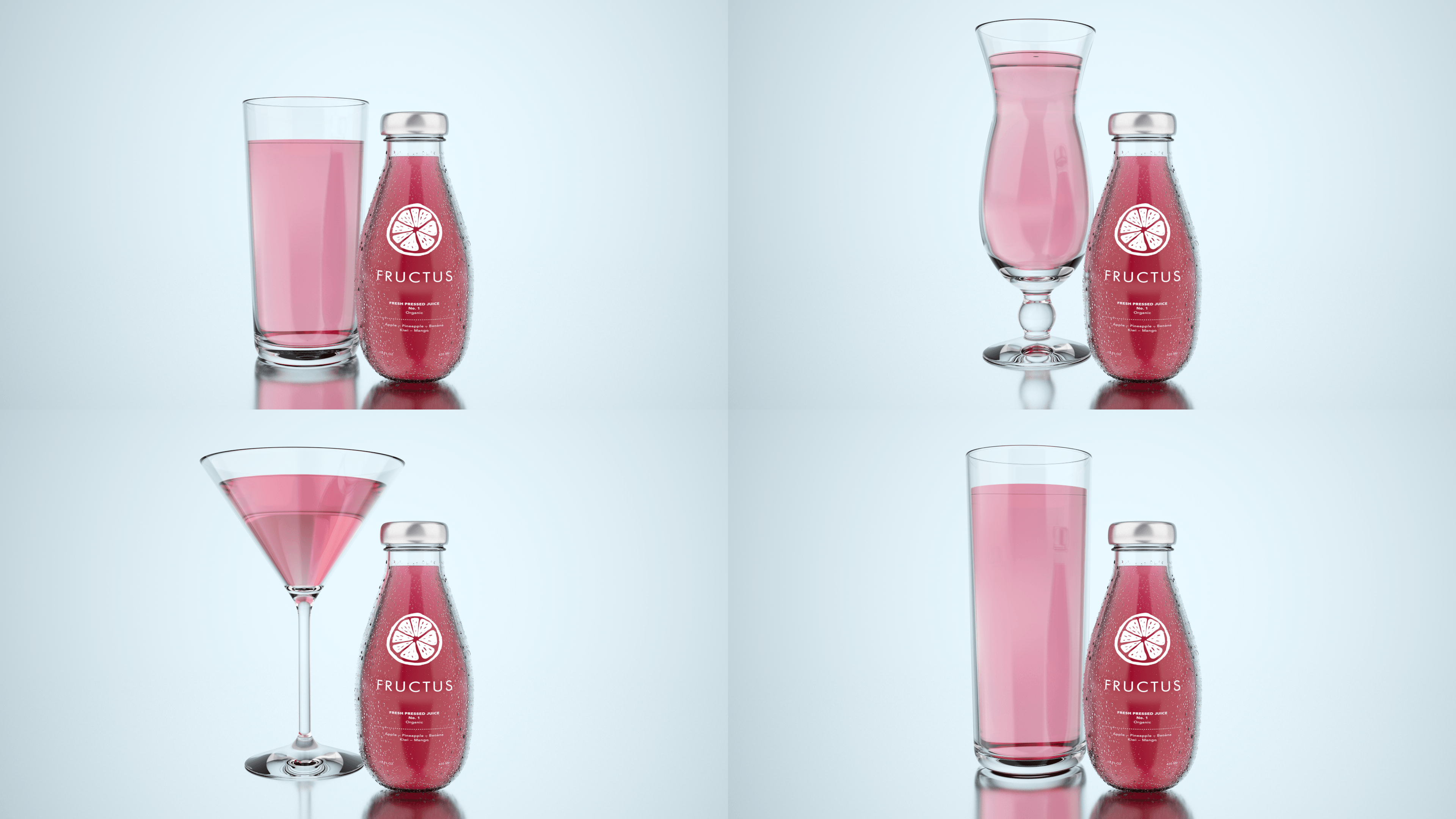
Overall, I’m really happy with the way the renders turned out and they look really good, specifically the High Ball & Zombie Glasses (Top Left & Bottom Right).

Like discussed above, I spent a lot of time altering the colours, absorption distance and strength to make it look realistic – because the volume of fluid in the glasses was much greater when compared to the bottled fluid, the overall colour looked much darker, and this really didn’t look good because in real life this wouldn’t have happened unless something was added to it –  this was my main motive for wanting to change the liquid colour in the glasses. In addition to the liquid colour inconsistencies, the Hurricane & Martini glasses have a funny visual defect that can be seen at the bottom of the glass – I’m not sure what is causing this, however, It could be the glass material properties and the way in which light refracts inside of the material. Finally, I feel that there is something missing from the render and that it needs an extra model to support it, after looking at pre-existing case-studies, I noticed a common convention where they all use a model of one of the ingredients inside the liquid to act as a prop, I feel like I need to do the same in support the bottle and glass.

Whats Next:

Next, I am going to model some fruit slices to place within the scene, which will further improve it as a whole and will help to unite everything together.

Glasses Modelling

Now that my main product has been completed to a high quality that is photorealistic, I need to produce supporting assets to help dress the set. When discussing my progress with my tutor, it was highlighted that the overall image of the product was good, however, it felt very empty. This lead to some discussion that the product could be further enhanced by adding glasses to the side of the product to denote the way in which the product is intended to be used. At first, I wasn’t too sure on the idea, however, after thinking it through it has grown on me – this would also mean that the idea behind the concept would have also changed from being a stand-alone drink to a cocktail mixer. Following this new direction, I started to source reference images and then begin modelling, which can be seen in my time-lapse below:

Overall, the models that were produced look really good and because I had already done this process with creating the bottles, it was really easy. I particularly like the High-Ball and Zombie glasses due to their thin glass walls which I feel would look really good with a liquid object inside of it, but I also really like the Martini glass because of its elegant shape.

Even though modelling the majority of the glasses were successful, I couldn’t successfully model the Pitcher. Due to its unique shaped pouring spout and handle, it made it particularly difficult to create as I had to manually manipulate the polygons by stretching them forwards and curving them around, which is something I had never done before. In addition, the model was also put into a subdivision surface (SDS) before making it editable – this meant that the object including the SDS was united into one object, thus increasing the number of points around the object which further made it difficult to add the pouring spout as there would too many to grab and move (this is visible within the time-lapse).

Renders:

Glasses1080

Out of the four models that I did successfully complete, they turned out very good. The realism on them is fairly good but they could be improved by adding the additional features to them such as the liquid and fruits etc, which would further compliment the product when integrated together.

Whats Next:

Next, I am going to integrate these glasses into the main project file, this will then be positioned carefully to set the scene in a pleasing way. After this, I will then develop liquid materials to go inside of the new glass models.

Fluid Material Creation

Using the pre-existing fluid object which I had created previously, I started to experiment with the Transparency and Reflection channels within c4d’s material editor in order to create a more realistic material for the product. When I started I didn’t know what ‘flavours’ or coloured materials I was going to create, I simply started to create something that looked real in order to achieve photorealism. Because the initial colour of the object was orange, I started with that – I disabled the colour and reflection channels and enabled the transparency, and using the water present within this I was able to create an orange looking material. After this, I then enabled the water present in the reflection channel which produced a good effect, however, it probably wasn’t necessary as the glass texture on the outside of the bottle created the main dominant reflections.

After these steps, there was a long period of fine-tuning – the colour specified within the transparency had a lot of strength to it, with the smallest amount of colour (controlled by the saturation slider) it had a drastic effect when rendered out, this colour strength change varied depending on how much material was behind it. After this process, I finally managed to get 3 material to a high realistic quality and rendered them out, these can be seen below.

Final:

Fluids

These are the final fluid materials that I had created, going in chronological order I had tried to create a Blood Orange, a Mixed Fruit and an Orange flavour. I feel that they look fairly realistic and this was achieved through experimenting with the transparency and reflection channels within c4d’s material editor, I was further able to fine tune this material through playing with the absorption distance to create a material that increased in transparency where thin – this is particularly evident in the top render where the main body of the fluid is a pink colour, however, towards the neck of the bottle where it gets thinner it becomes more orange.

Whats Next? 

Next, I am going to post these to social media to get a response as to whole realistic these materials are, and also how much the audience like them. This will then further allow me to make changes based on this feedback.

Condensation Creation

Using a tutorial found on YouTube, I am going to create condensation on the outside of the bottle. My processes and workflow can be seen in the time-lapse below where I experiment with different sized droplets and also the falloff for a more aesthetic look to the product.

Within this time-lapse, I documented my process of creating the condensation. This was fairly easy as I had step by step instructions from the YouTube tutorial on how to complete – the only difficulty I faced was forgetting to turn objects on again after making changes to my model. Because I made a lot of changes to the droplets, like checking their rotation and placement on the surface of the bottle, it made rendering out tests to the picture viewer more time-consuming. I would send the current frame to the render viewer and it would take about 2 minutes before I could actually start to see the model – this is mainly due to all the passes that are done in the Physical Renderer but it still meant that I had wasted some time on waiting around being unproductive.

However, even though I experienced this issue (to which I have now learnt to double check) the final result of the product looks very good and was worth while.

Final:

Condenstation2

Overall, the condensation effect is aesthetically pleasing and adds a nice feeling to the product – making it look more appealing to the audience. I feel the size of the droplets could be made a slight bit smaller to make it look more realistic as in the real world if water droplets were that big, gravity would make them fall down the bottle to the table surface.

Whats Next:

Next, I am going to work on the inside of the bottle and create 3 realistic fluid materials – each representing different flavours.

New Scene Production

After discussing my progress with my tutor about the scene creation, I wasn’t particularly happy with the background as it was too busy. I thought when planning this section that having an image in the background would be a good idea, however, this has seemed to have backfired – this is mainly down to the colours that were being used, as they were too similar. Because of this, I wanted to try and experiment with a different background that would put more emphasis on the product, the video below shows my creative process:

Within the video, I denoted the process in which I took to create the scene shown in the render below. I used a mixture of new techniques, such as using a mirrored floor surface to create a seamless background that could be easily changed through the alteration of one parameter, this enabled me to change the whole scene really quickly as I would only have to change the background plate  in order to get a whole new look. This worked out really well as I was able to get a nice look background for the bottle to be paced into that wasn’t too busy, allowing for the sole attention of the audience to be placed onto the product.

Final:

NewprojectsceneR

Overall, the render turned out really clean and minimal, which is a welcome positive to have as it greatly reflects my branding. The overall colour of the background has room for variation as subtle colour could be introduced to warm the overall image up or additionally, it could be used to contrast slightly with the liquid materials when they are created.

Whats Next:

Next, I will start to develop the condensation modelling that will be placed on the outside of the bottle, with the aim of sub-consciously suggesting that it is a refreshing and cool product.