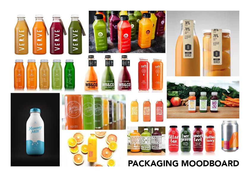
Above is a moodboard visually denoting early concepts for my packaging design. I will incorporate a minimalist theme into my product where only the essential information about the product is displayed, however, the graphical elements on the packaging such as the logo and UK nutrition labels will be designed to a high quality. In addition, the supporting information such as the description of the product and ingredients will feature an experimental and quirky layout, reflecting the company image. The product will also be made from recycled glass or plastic, not only making it environmentally friendly but also giving the sense of a premium product. Furthermore, the bottle would also be transparent allowing the colour of the liquid to show through the packaging. The transparency would then further compliment the typeface used as I would like it to be bold, sans-serif or organic. Allowing this, especially when coloured in white would contrast well against the liquid in the bottle.
Designing Usable Web Interfaces (2003)
Web design will be another aspect of my project that will help to contextualise all of my work. Studygin this book by Julius Wiedemann will aid my learning into the best web design to host videos on the site and will additional teach me the fundamentals to web design.
Within the book I will be specifically looking at Chapters:
- Types of Web Application (Page 13)
- The Project Development Process (Page 45)
- Interface Design (Page 93)
Types of Web Application
Brand Sites (Page 13) – Brand sites are often referred to as ‘Brochureware sites’ that build up a brand or product for an organisation. The sole objective for these sites is to create an online identity or prescence that the audience can access. Often reflecting the brand image and company morals, the websites that are built are often very aesthetically pleasing, ultisling the same design conventions that are used throughout their products in the real world.
The Project Development Process
Design (Page 54) – The design of a website is critical, often broken down in to 4 areas: information architecture, verbal communication, the use of media and the user interface design, it is essential that my website my follow strict guides within these areas in order to create an highly functional and aesthetically pleasing site.
Information architecture is process in documcntmenting the process flows of the audience, in simpler terms it means it documents that ways in which the audience will use the website in order to access the relevant information that they are after. This process often under goes several revisions, refining the design to make it as easy as possible for the audience to get the the info that they want.
Verbal communication is the selective process of deciding which technical terminology to use within the website, which can be a difficult process. For simple products, this can easy as there are no real terms that need to be utlised in the explanation of the product, however, for my technical products there has to be consideration taken into what vocabulary is used to describe the product as the audience might not necessarily understand it.
Use of media, this process is the stage in which media is evaluated in terms of its relevance. Often when products are being advertised on the website, it might not be relevance for it to be shown to the audience through the use of a video, sometimes a image will suffice.
Interface design, often referred to the stage where the website is given a personality, this process defines the stage in which the website gets colour, typography, media and other design elements added to it.
Interface Design
Colours (Page 97) – Colours have a powerful significance in communication, enabling them the ability to represent emotions and actions. Because of this, the use of colour a website has will greatly reflect certain meanings and messages behind it, this is why the colour of the website will often try an reflects the messages being the brand and the feelings that they want to denote to the audience.
Typography (Page 100) – Typography or font is the use of a particular style of text, this stage is very important as the type will need to be cohesive with the graphic style that is used throughout the rest of the website. There are often 3 different uses of type in a website or any publication: Heading, Sub-heading and Body Copy.
Layout (Page 103) – The layout of the information is the decision in which the placement of the text should be on the website. Most common layouts, columns are often used to break text up on a page to make it easier on the eye – convention used from print media which aim to make the page easier to ready but also aesthetically pleasing at first glance.
Jadav, A. (2003) Designing Usable Web Interfaces. New Jersey: Pearson.
Branding: From Brief to Final Solution (2002)
Branding will be a critical part to my project that will form the foundations to everything I produce in terms of style and design. Studying this book will teach the ways in which the presentation of products reflect onto the company itself.
Within the book I will be specifically looking at Chapters:
- Project 0.7 – Levi’s (Page 74 – 83)
Project 0.7 – Levi’s:
The chapter shows relevance to Branding, especially in the way denote the logo with the fashion books that the company has produced. The specific examples shown in the chapter denote the books and evaluates how contemporary they are in terms of layout, physical materials used to create the book and the use of colour – these examples given are a very good cast study as to how effective product creation can create a positive brand image that stands out to a particular demographic target audience. I feel this will be a very important section within my brand development and product production, as I want to achieve a certain brand image that targets a particular demographic. In addition, I will have to thin very clearly about the logo as an icon and its relationship between the image and the products.
Additionally, when merging the logo and its products together on paper, it allows for the overall image to be seen – As a way of comparing everything together, I feel that this might be a good way of evaluating how well the logo represents its products or vice versa, this will quickly show whether the branding for my cooncept is effective or whether it needs to be altered.
Design, M. (2002) Branding: From Brief to Final Solution. Switzerland: Rotovision.
Digital 3-D Design (2001)
3D design will be a critical part to my advertising for my products, this book explains in great detail the core concepts of 3D design that will be benefit me when creating my 3D animations, enabling me to advertise my products.
Within the book I will be specifically looking at Chapters:
- Core Concepts (Page 30-93)
Core Concepts
In this chapter, the core concepts of creating any 3D object are discussed, however the main concepts relevant to my project are listed below:
1) Modelling – In 3D design, most objects that are used within an animation or piece of 3D design are often modelled from scratch in two ways. Point by point modelling is one way were individual points or polygons are moved by hand to create the object desired and primitive modelling is another form were the use of simple shapes are created and merged together to make more complex objects. The latter type of modelling can be used within the 3D advertising section of my project as I will be able to use simple shapes to create fairly complex objects easily, this will greatly reduce the time needed to create all of the objects allowing me to focus on other aspects of my project.
2) Resolution – Resolution is terms of 3D design relates to the amount of polygons that are used within an object to make it smooth, the higher the count the smoother the object will be and this is the same for the opposite. When rendering it is essential that the amount of polygons used within the objects are at the optimum point as too little will make the object look rough in terms of its surface clarity and too many will slow the system down as each point will have to be computed by the RAM, leaving less for the program to operate.
3) Bezier, Splines and Surfaces – Bezier curves in this sub-section is covered in relation to object creation/modelling, these operate in the same way as they do in 2D programs such as Illustrator & Photoshop, once an anchor point has been created there is a tangent handle that allows for the user to alter the curve, this is turn will change overall shape of the object in 3D space.
4) NURBS & Sub-division Surface – NURBS or Non-Uniform Rational B-Spline is a special type of spline that allows for jagged lines to smoothed out, differing from normal splines. When made a child of NURBS, the overall smoothness of the line in controlled by degrees, meaning that the higher the degree value, the smoother the overall line shall be. This relates similarly to the resolution, as the number of the NURBS increases the overall smoothness does too and this is the same for the opposite.
5) Shading, Illumination and Specularity – Once the modelling and animating of the objects has been finalised, the last job to do is the texture painting of the objects to fully bring it to life. Shading, illumination and specularity are three key components that are emphasised in great detail that help to increase the realism of the product. It is stated that there are 3 parts to illumination – Specular, Diffuse and Ambient. Specular is the ‘hot-spot’ that you can see on shiny objects, this is often a direct reflection of the illumination source and help to determine to the user what type of material the objet is made from. Diffuse is the way in which the material diffuses the light illuminating it – this will often eliminate the specular highlight on the object and will turn it into a large broad section where the object is lit up. Ambient is the way in which the environment reflects the light being illuminated by the source object – high ambient illumination will often cause shadows of objects to be less apparent as the environment is reflecting more light onto the opposite side of the object.
Danaher, S. (2001) Digital 3-D Design. New York: Cengage Learning PTR.
Initial Idea’s #1
When contemplating different idea’s for my Semester B project, I initially wanted to continue with my project from Semester A and create a full animation that achieve a set duration. I really enjoyed creating the abstract sci-fi animation last year and by extending it, I would be able to develop my skills on creating a complex narrative that would fit in with the work that has already been completed, further developing my skills within Cinema 4D and also in After Effects CC for post-production. However, as the main brief last year was outlined by the competition I entered, The X-Particles Challenge 2017, I had no valid reason to justify any decisions that were made – this year I would like to do the same as it leaves less room for variation later down the production line as the brief is already pre-composed.
Although this idea seemed acceptable at first, I didn’t feel the quality of the overall animation produced in Semester A matched the quality level I wanted it to be at. I feel that this factor was mainly down to the materials that were used as they weren’t realistic enough and also down to my own technical ability to create something realistic in modelling terms. These factors finalised my decision to change my project as I want to create a media artefact that was different and to a high quality to add to my portfolio, to which I will have to research into further.
