Typeface/ Typography Research
Definition: Typography is the way in which type is arranged. This incorporates the different typefaces that you use and how you layout design of the text that most suits your colour scheme.
Within this research I will break down the critical components of typography into:
- Typefaces
- Colour Systems
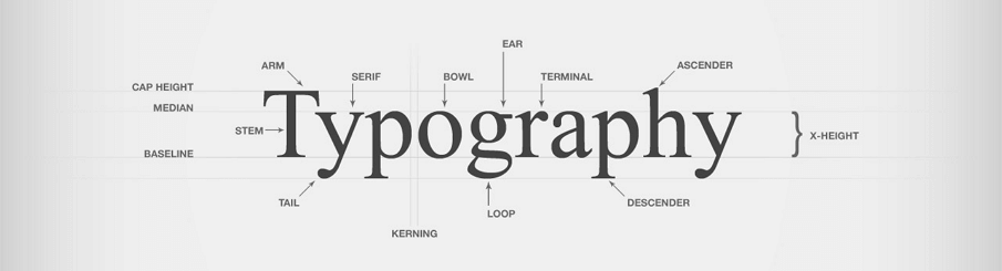
Typefaces:
Serif:
Serif typefaces, often used within print publishing have a particular type of stylistic design known as serif strokes, these strokes can be seen at the ends of the letters with a small flick or stroke. With this, Serif Typefaces can be further broken down into four sub-categories:
- Old style – Similar to Old English type, Old Style carries over the traditional look whilst updating it slightly. Each serif design is rather small, the letter forms themselves tend to be quite rounded with even thickness and strokes.
- Modern – Modern Serifs are predominantly used within the newspaper industry and use an attractive stylistic design of both thick and think strokes to create contrast. They are best used in an authoritarian manner because of its long-standing associate with the new and use in newspaper design.
- Transitional – traditional Serif typefaces are most popular in digital work because of its traditional style and modern serifs, it creates rounded shapes and has varying strokes.
- Slab – Slab Serifs are a bold and big typeface often having a thick and uniform strokes either with rounded or squared edges.

Sans Serif:
Often having a wide range in selection and being easy to read, Sans Serif typefaces have all the same characteristics of the their counter-parts, however, they don’t have the small strokes at the end of the letter making them contrast effectively against backgrounds.
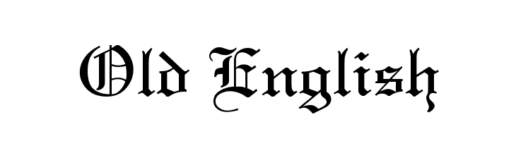
Old English (or Black Letter):
The Old English typeface is a category for old type, dating back to the middle ages when they were made by pen and paper, these can be characterised by many elaborate and broke strokes for each letter. These typefaces often have a limited use range from one to two words, however, it gives a sense of age or history with what it is applied to.
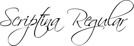
Script & Cursive:
Script and Cursive typefaces are designed to mimic handwriting, the only difference between being Script typefaces are connected together, whereas Cursive isn’t. This elegant smooth typeface is stated to have a feminine feel and is best used in a large size as its legibility decreases with its size.
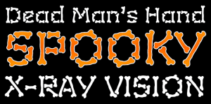
Novetly:
Novelty type incorporate a wide variety of different typefaces as they cannot be characterised into a specific category. However, because of this feature, novelty typefaces are often fun and interesting to observe and can be very playful when the mood of them matches the item or object that they are describing. Below is an example of a novelty typeface and how effective they can be when matched accordingly with an item/object.
Colour Systems:
CMYK:
CMYK refers to full colour printing using 4 colours Cyan, Magenta, Yellow and Black. This colours system is often used for physical printing, when something is being designed for the real world, the CMYK system will be used as it can successful recreate any colour in the visible spectrum.
When an image needs to be printed out, the CMYK process determines the percentage of each of the four colours that is needed to make that colour. Then when it comes to the actual printing of the image, it transfers those percentage values into small dots to blend together.

RGB:
RGB is the colour system that is used for digital monitors and televisions. Uses pixels, they are able to produce red, green and blue light at any percentage to create different colours via pixels, these colours produced are known as hexadecimal values.
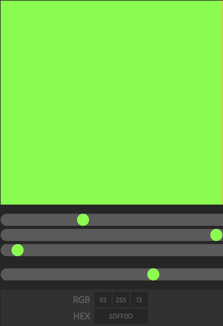
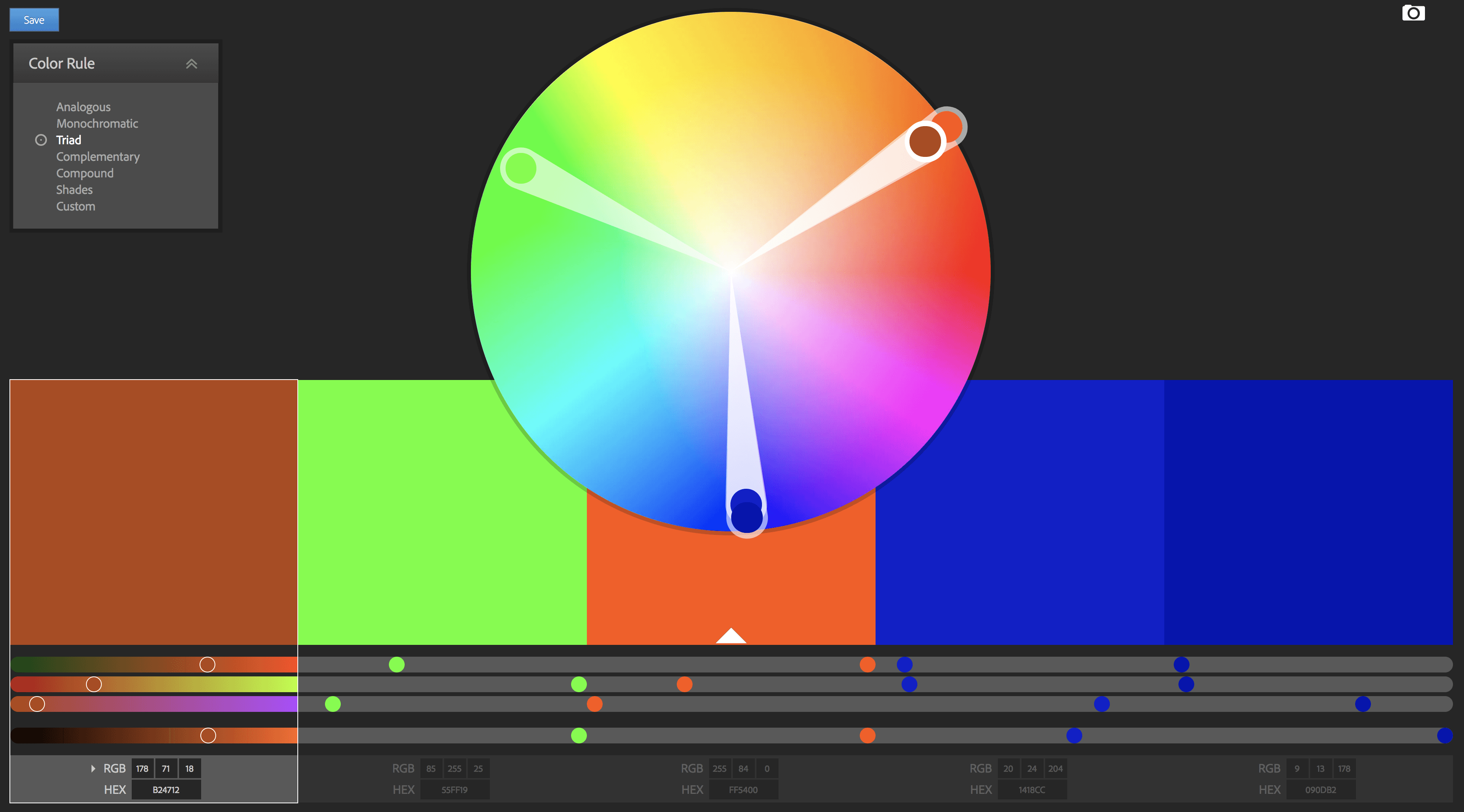
Within RGB, there are also colours rules that can also be followed:
Analogous: Similar colours all within a range.
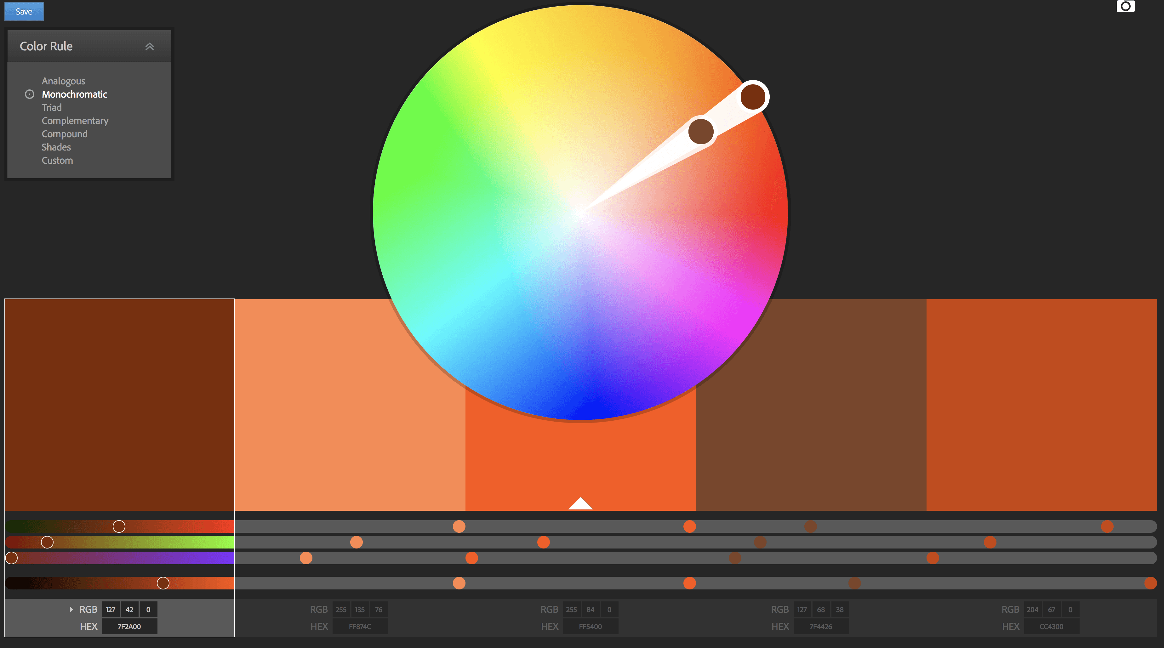
Monochromatic: The same colour along the same line – In Adobe Colour’ website, this line points towards the centre.
Triad: Three colours that complement each other, e.g. Green, Blue and Orange.
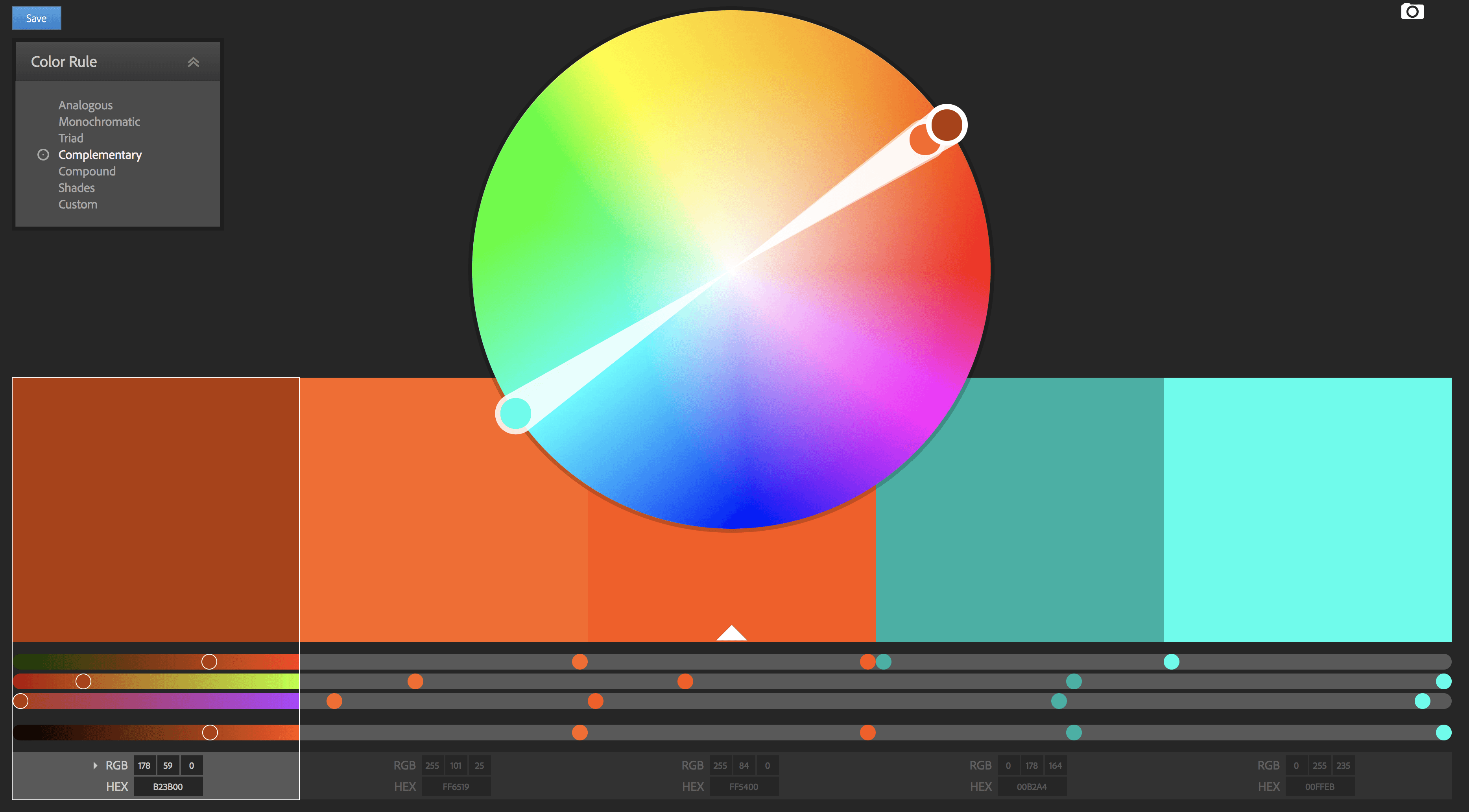
Complementary: Opposing colours in the colour wheel, e.g. Cyan and Orange.
Compound: Another variation of the complementary colour scheme, where additional shades of the complementary colours are added to the mix.

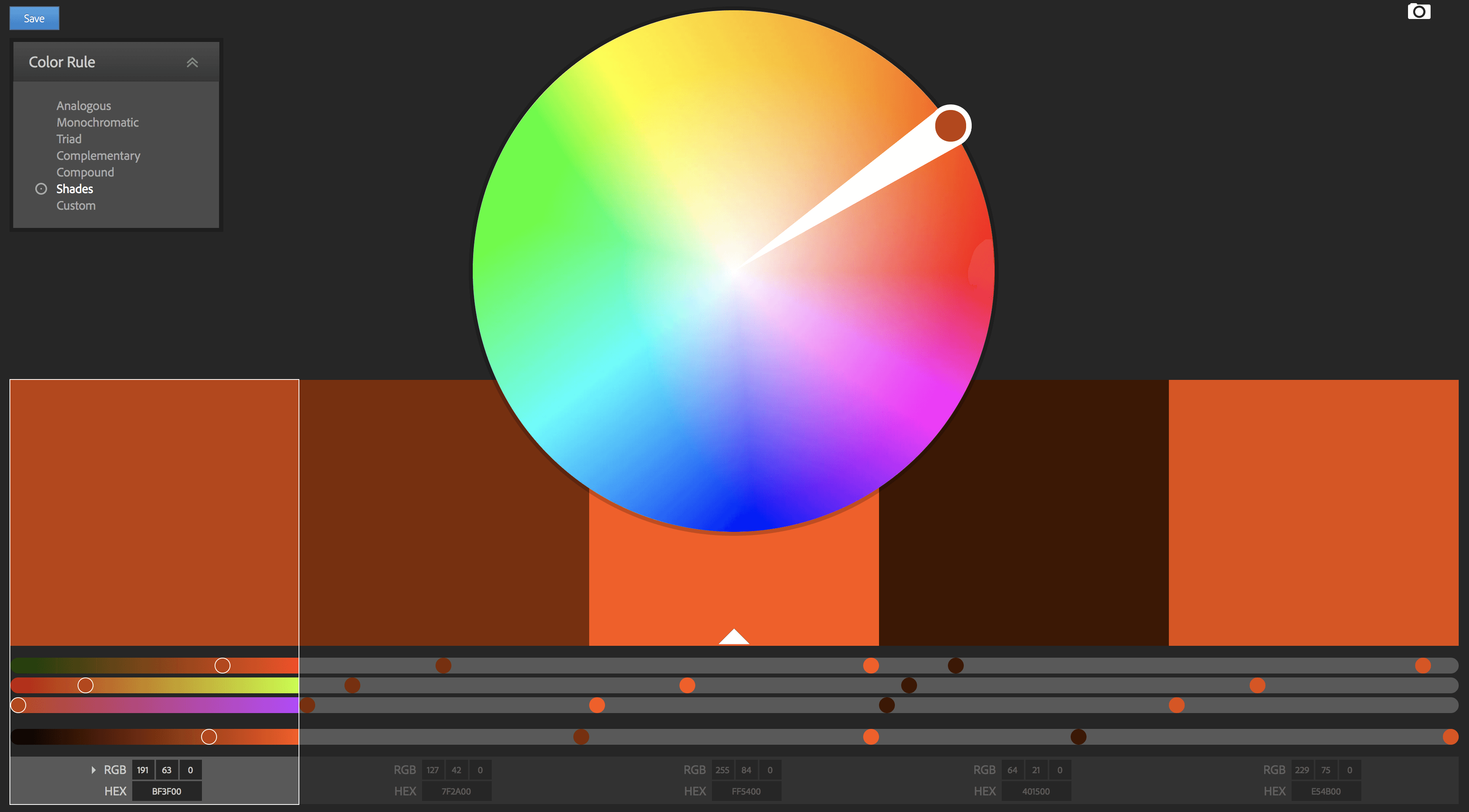
Shades: Shades of the same colour.
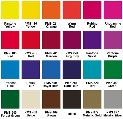
PMS:
Pantone Matching System that uses thousands of coloured swatches to match colours, for example, in a logo the colours that are used can be identified by a number from this system, often referred to it as a PMS number.
The benefit of PMS over CMYK is that only the colours that you need are being used, in most cases this will be 2 or 3, saving money whilst providing the most accurate colour as well as the sharpest details. With `CMYK on the other hand, 4 colours will have to be used in order to create the different colours due to combination of them all.