Anchor Links

As the last part of my Muse research, I wanted to explore what Anchor Links are. From previous projects I have used them before, however, since then I have completely forgotten how to use them. By researching them it would a good opportunity to refresh my memory o them and also explore what other options I have available for using them.

Exploring YouTube, I found this video below explaining how to use them exactly within a one-page website. Here it is:

From the video, I found that the anchor link system is often used on a one-page website. In the example above, the man used different coloured sections to represent different parts of the website, and then used the anchor point tool, denoted by an anchor symbol in the toolbar to add different points on the page that were then named. From this, each of the anchor points was placed in the centre of the page of every section and then linked accordingly via the hyperlinks tab to the menu. This enabled all of the links to redirect the user to relevant sections (if linked correctly).

Conclusion:

I feel that using this on a one-page website is very practical as it saves the user from having to scroll a lot. However, from my plans, I decided to use multiple pages in order to break the website up which I feel would make it easier for the user trying to find info about my product. I will have to research further to see if I can still use the anchor points to link different pages together, and if not, I will have to find a solution which will work for me.
Rollover Effects

Along with my Adobe Muse research, I wanted to explore my options with Rollover Effects. From my previous projects, I have experimented with different rollover effects to support a product by revealing additional information about a topic – this was a really inventive way to display the information without cluttering up the webpage, but it also helped to increase the presentation quality. By further exploring my options into all of the different rollover effects I would be able to achieve, I will be able to select the ones that would be best suited to complete the function that is desired, either being an animated rollover effect for a button or image.

From a generic YouTube search, I came across a plethora of videos discussing rollover effects within Muse, and after watching multiple I concluded that they all gave the same information. However, here’s two really good examples of rollover effects used in an aesthetically pleasing way:

From the videos, I have learnt that the basic form of rollover effects stems from the states panel at the top left of the screen. In simple terms, one object on the website can have 4 different variations due to the 4 states that it can be in Normal, Rollover, Mouse Down and Active. This is where the predominant changes can happen, and when these changes are made, they don’t affect any of the other states. For example, A square in the ‘Normal’ state could be coloured grey, and then, if the state of the object was changed into ‘Rollover’, the user could then change the colour to red. This would mean that the square in the browser would be grey until the cursor rolled over it.

Although very simple, this could then be developed by adding extra elements such as lines, like in the video above, further adding to its visual complexity. The same rules also apply for images where one image can be programmed to change to a different image once rolled over, which can also be further stylised with transition effects such as a transition period and delay, defining how long it takes the images to transition to one another, and also how long it takes for the transition to begin after the cursor hovers over the image.

Conclusion:

Although these rollover effects for both buttons and images demonstrated within the two videos are aesthetically pleasing, their design style might not be suitable for my product and the image I want to create for it. I feel the rollover functionality on the images is dated and would benefit more from a Parallax effect being used on it with a scroll effect, however, this is not to say that I would completely disregard the use of rollover effects, as I have found another tutorial on a rollover home/back button which is very interesting.

They use of this, although made completely redundant by the back buttons available on the browser does add a nice effect and is also executed by effectively.

Scroll Effects

Within Adobe Muse, there are some really creative ways to add movement to your website known as scroll effects. These usually take the scrolling feature of your mouse to play with the movement of different assets within the webpage. After creating a plan for my website, I already knew that I wanted to incorporate this feature into the History page where the scroll feature would allow the user to scroll through the company history and see where it started. After a search on YouTube, I came across this video which was coincidentally by the same author of the Responsive Design video. Here it is:

From this video, it taught me how to incorporate these scroll effects into the design my website. Using the Scroll effects tab on the right-hand side menu, I will be able to select an object that I want to have animation and check the motion box. By doing this I am able to establish the key position of the object, meaning the position it starts at and also gives me the ability to state the direction and speed the animation occurs, which is defined by the scroll rate, meaning that if the speed is at 2, the animation will play through on the website in the browser at twice the speed of scroll. These rule also apply to the existing animation of the object during the period it animated out, the exit direction is defined as well as the speed allowing to fully animate in then out again.

Following from this, I will also be able to control the opacity of object through the use of the scroll functionality, this is done in the exact same way, however, the start and end point need to be defined denoting what the starting opacity will be and what the ending opacity will be. I feel that this coud be useful within the history page as I want it to fade in from right to left and exit the same way, by perfecting the opacity I will be able to add smoothness to the animation, thus increasing the quality.


Responsive Design

When creating my website in Adobe Muse, I want it to have a responsive design. Responsive design is an approach web-designers make to their websites and pages so that they present well on a collection of device screens, ranging from laptops to tablets to mobile phones (each has a different sized screen). Having this responsive design implemented into my product will make it accessible to my target demographic from multiple devices and this will furthermore allow me to optimise their experience on that specific device when browsing the website.

From a google search, I came across a video produced by Adobe which went into great detail about how to effectively execute a responsive design to a level at which I could understand it. Here it is:

From this video, it taught me about the basics of how to implement a responsive design into my website. Using the Breakpoint Bar located at the top of the screen, I will be able to use a slider to minimise and maximise the page to simulate different sized screens, this will allow me to see when objects within the page will contact, further showing me when I need to add a new breakpoint. After a new breakpoint is added, I would then alter the layout of the page so that none of the objects contacts each other – this is good as I can any changes I want without affecting any of the other breakpoint settings. This also means that I can optimise it the website for different devices –  as none of the settings on the current breakpoint affects any of the other breakpoints, the scale of some objects within the page can be reordered better for a smaller screen, meaning that would all be perfectly sized.

Following on from this, when the size of the webpage is smaller, some of the objects can be changed to suit the user. For example, within the video, the creator knew that when the webpage screen was at a small size, it would be predominantly used by mobile devices, this meant that she could change the banner menu to an Accordion menu to benefit tablet and mobile phone users. I thought that was really cool and would be something I would really want to incorporate into my own design.

HDRI Collection

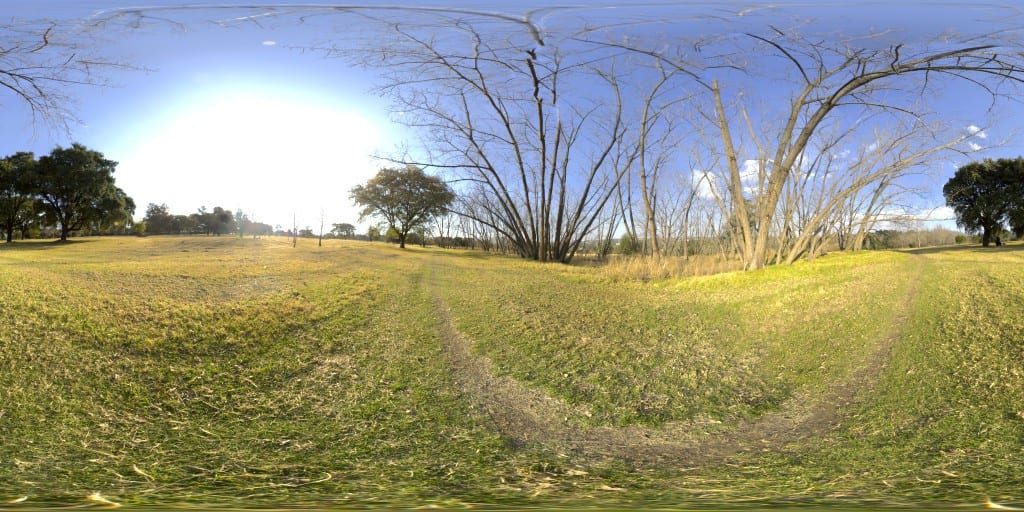
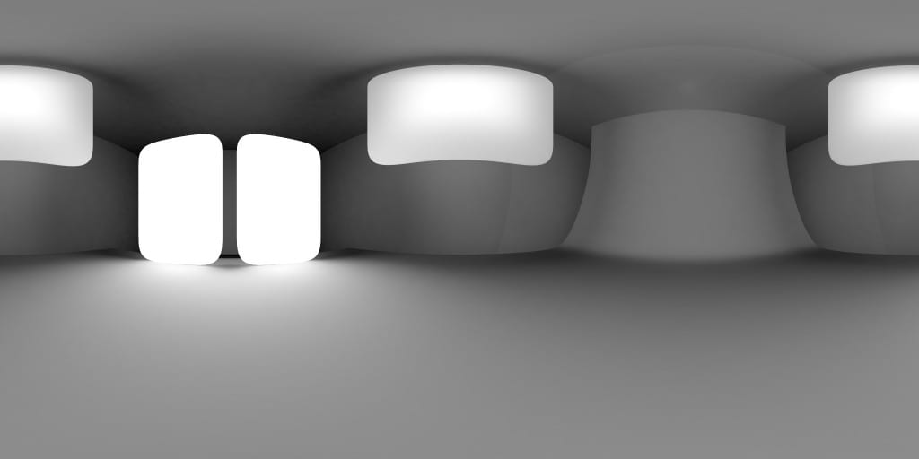
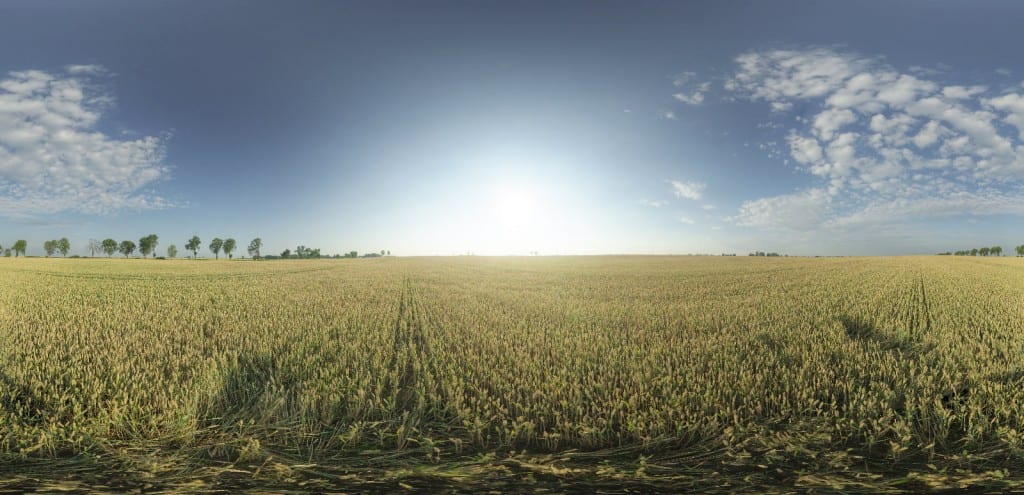
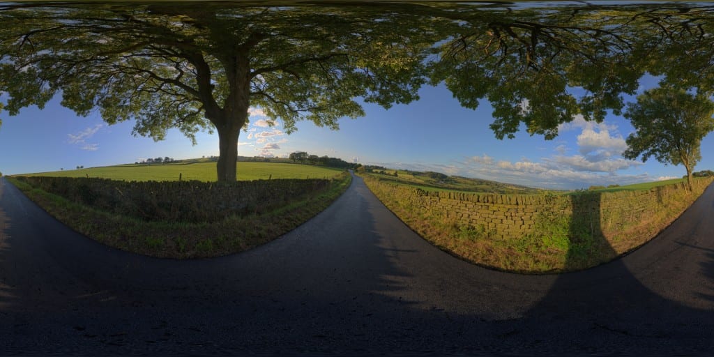
After conducting my lighting research, I realised how important it was to get a variety of HDRI environments to boost the realism of the scenes. I set out a small task to gather a variety of HDRI maps from online galleries and libraries to give me the best results when rendering. After some time searching, I came across HDR Maps which had a wealth of free and high quality resources. I selected a mixture of HDRI maps that had areas of high amounts of light with shadows, fully lit maps and also ones that will similarly match the backgrounds of the environment that the adverts will be in.  Heres a few examples of what I collected:

10-free-hdri-spherical-skies-maps-1 CountryRoadEve_02_Thumbnail delta_2k Multi-Area-Light thumbnail