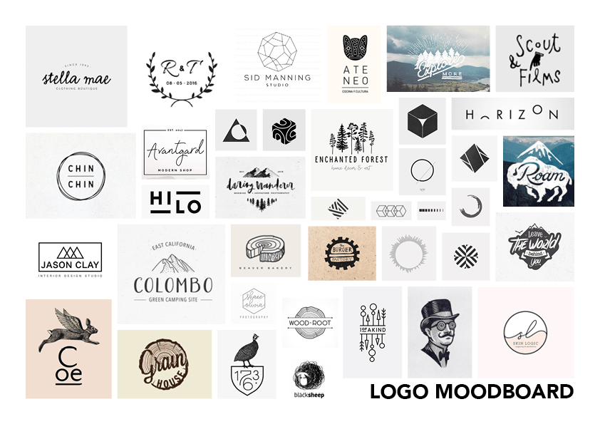
 Above is a collection of minimalist logo’s that incorporate an image element as well as a calligraphy typeface together to form a combination logo. I would like this logo to look aesthetically pleasing on black on white and white on black so that when it is applied to my packaging no matter what colour the liquid is inside it will work effectively. The use of text and an icon is formerly known as a combination mark logo, this will help to establish some ideologies behind the company when the audience takes a glance at the packaging or the website. The complexity of the icon will have to vary depending on what scale it is at, is the icon is at a small-scale, for example on the packaging the details within the icon will have to be reduced so that it will be clear. Furthermore, this will be the opposite of when the icon is that a larger scale, for example on the website where more detail can be added.
Leave a comment