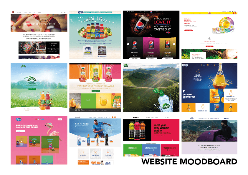
Above is a collection of websites that all follow similar visual and design conventions that I would like to incorporate into my own website. Within my website, I will utilise a rigid grid structure, much like the ones used in the Orangina, Pepsi and Vitamin Water examples which will help to break up the different segments of the website. By designing the website like this, it will allow the audience to easily navigate to the information that they want to find out, without hindrance. Within this grid structure, the use of colour will be coherent with the packaging, creating synergetic links between the physical and online presence of the company. Within the online presence of the company, images will be used to visually display the product, which will be done through the use of photo-real renders to give the audience a realistic representation of what they might buy.
