Initial Idea’s #2

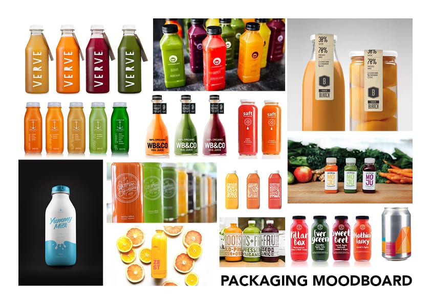
After making my decision to change ideas, I have been thinking about different technologies and software which I could potentially use. After completing my last semester’s project, utilising Cinema 4D I wanted to take a more design-oriented path for this semester. When discussing my problems with a tutor, it was suggested that I could potentially create a Company and utilise my design skills to create a logo and packaging labels, as well as utilising my learn skills from last semester to produced 3D models of this product and to also create a 3D animation used for advertisement.

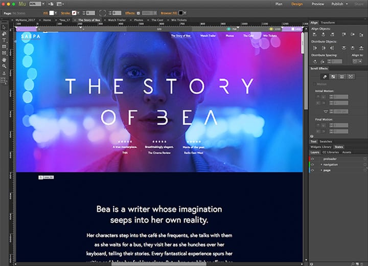
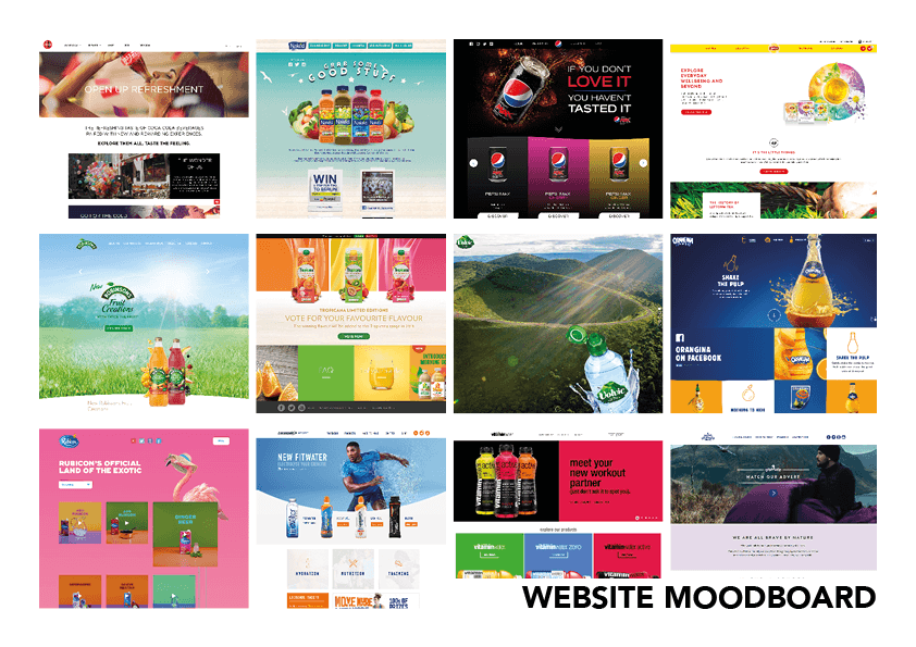
This project is going to be very exciting as it allows me to create work which will come together at the end to produce an aesthetically pleasing media product. To contextualise all of the outputs which I intend to create, I will construct a website utilising similar design themes making all of the outputs coherent. The project will test abilities and knowledge of software’s, such as Adobe Muse, Adobe Illustrator and Cinema 4D, as well as my abilities in transferring my work into the other software.

mu-riverflow-1-720x520


Branding Moodboard – Logo

Logo MoodboardAbove is a collection of minimalist logo’s that incorporate an image element as well as a calligraphy typeface together to form a combination logo. I would like this logo to look aesthetically pleasing on black on white and white on black so that when it is applied to my packaging no matter what colour the liquid is inside it will work effectively. The use of text and an icon is formerly known as a combination mark logo, this will help to establish some ideologies behind the company when the audience takes a glance at the packaging or the website. The complexity of the icon will have to vary depending on what scale it is at, is the icon is at a small-scale, for example on the packaging the details within the icon will have to be reduced so that it will be clear. Furthermore, this will be the opposite of when the icon is that a larger scale, for example on the website where more detail can be added.

Branding Moodboard – Website

Website Moodboard

Above is a collection of websites that all follow similar visual and design conventions that I would like to incorporate into my own website. Within my website, I will utilise a rigid grid structure, much like the ones used in the Orangina, Pepsi and Vitamin Water examples which will help to break up the different segments of the website. By designing the website like this, it will allow the audience to easily navigate to the information that they want to find out, without hindrance. Within this grid structure, the use of colour will be coherent with the packaging, creating synergetic links between the physical and online presence of the company. Within the online presence of the company, images will be used to visually display the product, which will be done through the use of photo-real renders to give the audience a realistic representation of what they might buy.

Branding Moodboard – Packaging

Packaging Moodboard

Above is a moodboard visually denoting early concepts for my packaging design. I will incorporate a minimalist theme into my product where only the essential information about the product is displayed, however, the graphical elements on the packaging such as the logo and UK nutrition labels will be designed to a high quality. In addition, the supporting information such as the description of the product and ingredients will feature an experimental and quirky layout, reflecting the company image. The product will also be made from recycled glass or plastic, not only making it environmentally friendly but also giving the sense of a premium product. Furthermore, the bottle would also be transparent allowing the colour of the liquid to show through the packaging. The transparency would then further compliment the typeface used as I would like it to be bold, sans-serif or organic. Allowing this, especially when coloured in white would contrast well against the liquid in the bottle.

Initial Idea’s #1

When contemplating different idea’s for my Semester B project, I initially wanted to continue with my project from Semester A and create a full animation that achieve a set duration. I really enjoyed creating the abstract sci-fi animation last year and by extending it, I would be able to develop my skills on creating a complex narrative that would fit in with the work that has already been completed, further developing my skills within Cinema 4D and also in After Effects CC for post-production. However, as the main brief last year was outlined by the competition I entered, The X-Particles Challenge 2017, I had no valid reason to justify any decisions that were made – this year I would like to do the same as it leaves less room for variation later down the production line as the brief is already pre-composed.

BannerImage

Although this idea seemed acceptable at first, I didn’t feel the quality of the overall animation produced in Semester A matched the quality level I wanted it to be at. I feel that this factor was mainly down to the materials that were used as they weren’t realistic enough and also down to my own technical ability to create something realistic in modelling terms. These factors finalised my decision to change my project as I want to create a media artefact that was different and to a high quality to add to my portfolio, to which I will have to research into further.