After posting my different logo designs on social media for feedback, the general consensus from the group was that the third logo or the half cut orange was the most preferred. I wasn’t particularly keen on it at the start, however, after leaving it for a couple of days it grew on me. From this point, I then decided to try and experiment with the name of the company under it – as Fructus isn’t a well-known brand, having just the logo on its own wouldn’t be a good idea, the potential consumers of the product would see the logo and wouldn’t understand who makes it. The key to logo design from a new company is consistency – having a logo image that changes every time with a new product wouldn’t allow for the consumers/audiences to become familiarised with the brand and image – they wouldn’t be able to associate the two together making it less memorable. Because of this, I decided to stick with the half-cut orange logo and then further experiment with different typefaces, which can be seen below:
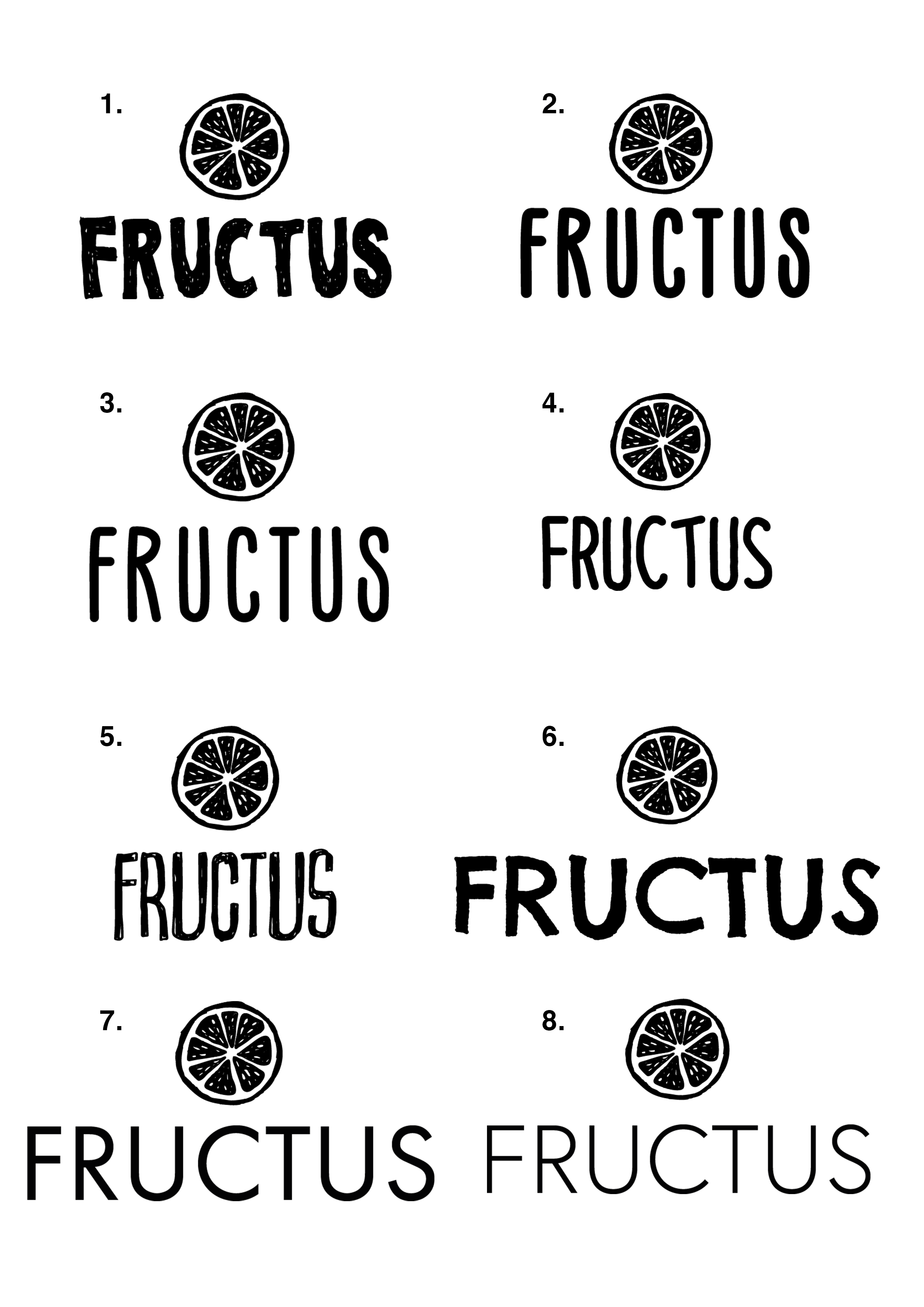
Overall, the use of the sketched logo style with hand-written typeface, used in examples 1 – 6 gives an overall feeling of inexperience. The overuse of the cartoon-like theme makes it seem like a young child made them and seems to target itself at a lower demographic as a result – even if the graphic styles of the two elements match it gives me the sense of cheapness and again put together in a non-caring way without quality. Oppositely, the uses of a sans-serif typeface, like in 7 & 8 accompanied by the sketched logo style gives a harmonised feeling, much like Ying and Yang but with its own fun twist – the two different styles co-ordinate together and create a more rounded brand image that can be aimed at a large demographic.
Final:
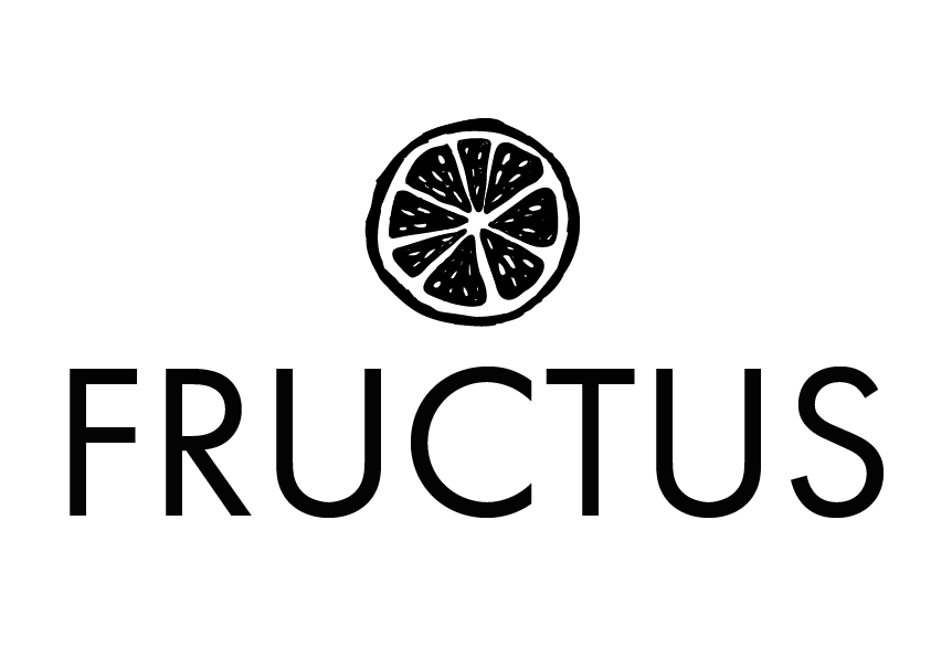
As a result of my analysis of the logos, I have deiced to use logo number 7 for the reasons listed above. In addition to those, I feel that the bold text in No.7 will be easier to read when applied to the bottle in c4d, I feel that the weight of the text in No.8 is just a little bit too light for it to be easily legible, which is a major factor when designing a product label – it has to effectively communicate its information to the consumer/audience.