Condensation Creation

Using a tutorial found on YouTube, I am going to create condensation on the outside of the bottle. My processes and workflow can be seen in the time-lapse below where I experiment with different sized droplets and also the falloff for a more aesthetic look to the product.

Within this time-lapse, I documented my process of creating the condensation. This was fairly easy as I had step by step instructions from the YouTube tutorial on how to complete – the only difficulty I faced was forgetting to turn objects on again after making changes to my model. Because I made a lot of changes to the droplets, like checking their rotation and placement on the surface of the bottle, it made rendering out tests to the picture viewer more time-consuming. I would send the current frame to the render viewer and it would take about 2 minutes before I could actually start to see the model – this is mainly due to all the passes that are done in the Physical Renderer but it still meant that I had wasted some time on waiting around being unproductive.

However, even though I experienced this issue (to which I have now learnt to double check) the final result of the product looks very good and was worth while.

Final:

Condenstation2

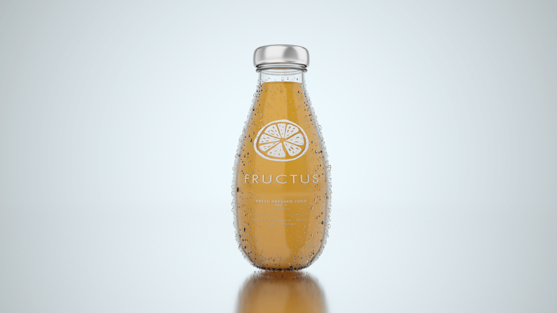
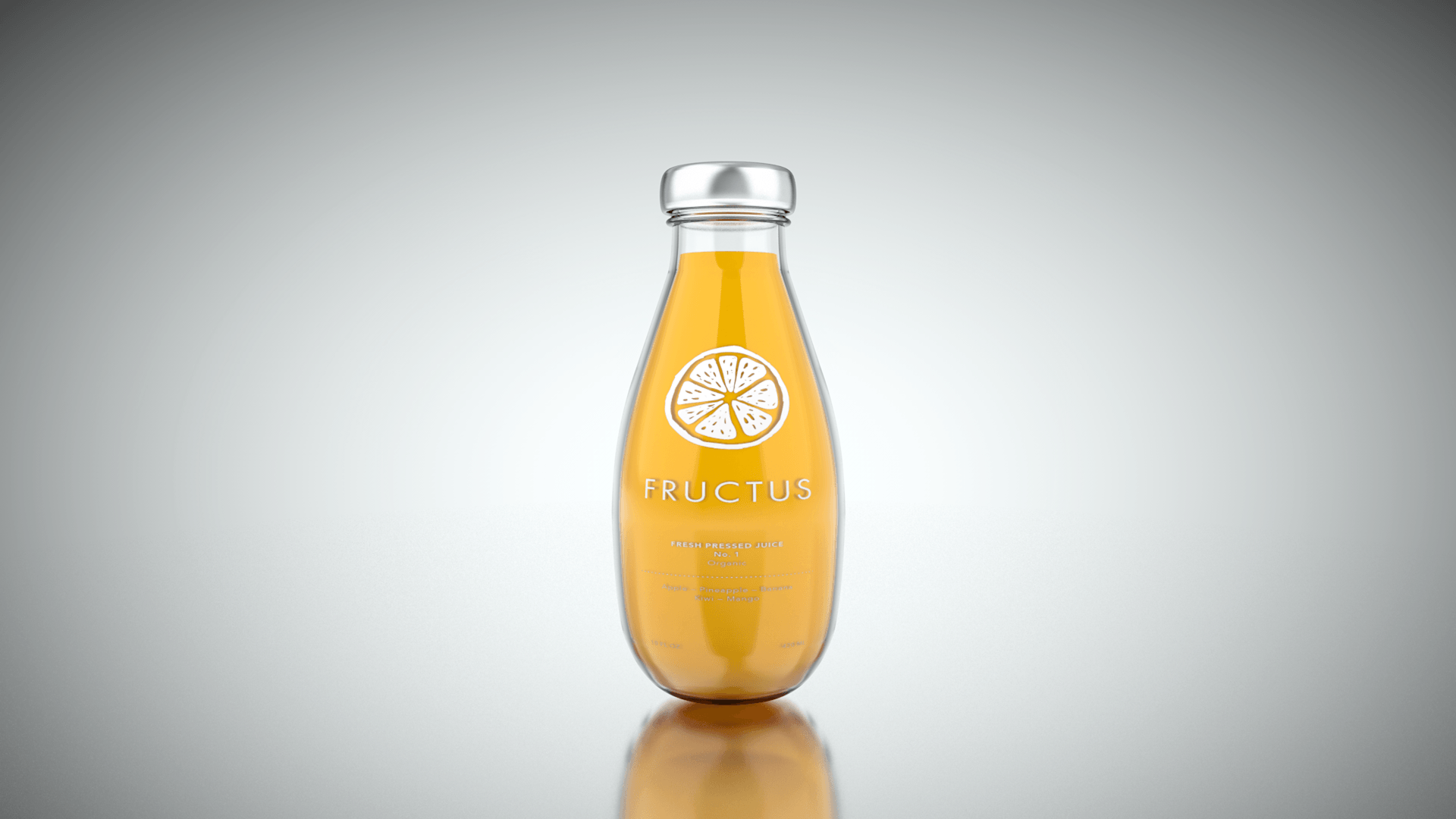
Overall, the condensation effect is aesthetically pleasing and adds a nice feeling to the product – making it look more appealing to the audience. I feel the size of the droplets could be made a slight bit smaller to make it look more realistic as in the real world if water droplets were that big, gravity would make them fall down the bottle to the table surface.

Whats Next:

Next, I am going to work on the inside of the bottle and create 3 realistic fluid materials – each representing different flavours.

New Scene Production

After discussing my progress with my tutor about the scene creation, I wasn’t particularly happy with the background as it was too busy. I thought when planning this section that having an image in the background would be a good idea, however, this has seemed to have backfired – this is mainly down to the colours that were being used, as they were too similar. Because of this, I wanted to try and experiment with a different background that would put more emphasis on the product, the video below shows my creative process:

Within the video, I denoted the process in which I took to create the scene shown in the render below. I used a mixture of new techniques, such as using a mirrored floor surface to create a seamless background that could be easily changed through the alteration of one parameter, this enabled me to change the whole scene really quickly as I would only have to change the background plate  in order to get a whole new look. This worked out really well as I was able to get a nice look background for the bottle to be paced into that wasn’t too busy, allowing for the sole attention of the audience to be placed onto the product.

Final:

NewprojectsceneR

Overall, the render turned out really clean and minimal, which is a welcome positive to have as it greatly reflects my branding. The overall colour of the background has room for variation as subtle colour could be introduced to warm the overall image up or additionally, it could be used to contrast slightly with the liquid materials when they are created.

Whats Next:

Next, I will start to develop the condensation modelling that will be placed on the outside of the bottle, with the aim of sub-consciously suggesting that it is a refreshing and cool product.

Scene Creation & Label Integration

After creating the liquid objects for all of the models, I wanted to create the scene in which the models were going to be placed in when rendered. Using my knowledge from previous projects, I started to create the scene with textures in order to stage the models, documented in the video below I discussed these developments and also further talking about problems I encountered.

The creation of the scene was a very easy process to complete initially as I understood the basics of setting it up, however, when it came to making the fine adjustments that was when I found it consumed a lot of time. One specific example of this was adding depth of field, I experimented with this in two ways: by actually adding it to the camera under the render settings and also by adding blur to the background image in the material editor. I found that adding depth of field to the camera under the render settings worked the best as it allowed for a smoother transition from focus point to the unfocused (blurry) point in the image – by using the other method, all of objects in the foreground were clear and didn’t look aesthetically pleasing when next to the blurry background image.

Renders:

These are the renders of the scene – specifically the images & textures that were used. I used one model to act as a placeholder so I could get a better feel for the set up of all of the scene objects and camera positions to best show off the product.

FinalR

Overall, I think the lighting of it was really good and helps to bring the product to life as it looks real, however, after a lot of thought and reflection I’m not sure that the background suits the style of the product – because the product is supposed to be minimalist, I feel there is too much going on in the background which will distract the audiences eye. In addition, trying to think ahead to the creation of my website, will these images conflict with the minimalist theme that I intend to use throughout the website or will it prove more difficult for me to integrate them.

Whats Next?

Next, I will make some adjustments to the label, fixing points which I highlighted in the video – I will then follow up on this with a render to show its changes. As well, I will also start to work on the liquid materials, focusing on trying to create something that looks realistic. Finally, I will also aim to produce an alternative scene, one that better suits the minimalist design utilised throughout my product.

Liquid Creation

After my last modelling post where I showed all of the different bottle designs, I wanted to take these further by creating the liquid that goes inside of them. Using my research from the prior posts, I started to create the liquid and also documented my process in the video below.

The overall the results turned out really well, the bottle with the liquid looks really good especially when the liquid inside has some transparency (not shown in the video) as it looks even more realistic. Prior to this video, I had completed a test to make sure my processes worked, enabling me to successfully create it on the screen recording – I had found out that it was best to make the liquid object inside of the bottle slightly smaller so that the inside spline of the bottle and the outer spline of the liquid didn’t intersect – not completing this produced some visual defects on the render where the liquid visible popped through the glass. However, from the video above, you can see that I included this step within my process and didn’t encounter this problem.

Final Renders:

These are all of the renders of all of the bottles, I wanted to see what they all looked like with liquid inside of them before choosing the final bottle, I feel that showing them with something inside will drastically change the way they appear and also the way in which light interacts with the liquid.

Bottle&Fluids

These turned out really well and further support my statement of making some of the bottles look more aesthetically pleasing – especially bottles 1, 3, 5 and 6. I feel that these will be the ones which I continue forward with my testing with the labels and caps (and then from this, I will choose one of four for the final bottle for my product).

Whats Next:

Next, I will start to create caps for all of the models, in addition to adding the labels to them.

Logo Update

After posting my different logo designs on social media for feedback, the general consensus from the group was that the third logo or the half cut orange was the most preferred. I wasn’t particularly keen on it at the start, however, after leaving it for a couple of days it grew on me. From this point, I then decided to try and experiment with the name of the company under it – as Fructus isn’t a well-known brand, having just the logo on its own wouldn’t be a good idea, the potential consumers of the product would see the logo and wouldn’t understand who makes it. The key to logo design from a new company is consistency – having a logo image that changes every time with a new product wouldn’t allow for the consumers/audiences to become familiarised with the brand and image – they wouldn’t be able to associate the two together making it less memorable. Because of this, I decided to stick with the half-cut orange logo and then further experiment with different typefaces, which can be seen below:

logos

Overall, the use of the sketched logo style with hand-written typeface, used in examples 1 – 6 gives an overall feeling of inexperience. The overuse of the cartoon-like theme makes it seem like a young child made them and seems to target itself at a lower demographic as a result – even if the graphic styles of the two elements match it gives me the sense of cheapness and again put together in a non-caring way without quality. Oppositely, the uses of a sans-serif typeface, like in 7 & 8 accompanied by the sketched logo style gives a harmonised feeling, much like Ying and Yang but with its own fun twist – the two different styles co-ordinate together and create a more rounded brand image that can be aimed at a large demographic.

Final:

Lo-19

As a result of my analysis of the logos, I have deiced to use logo number 7 for the reasons listed above. In addition to those, I feel that the bold text in No.7 will be easier to read when applied to the bottle in c4d, I feel that the weight of the text in No.8 is just a little bit too light for it to be easily legible, which is a major factor when designing a product label – it has to effectively communicate its information to the consumer/audience.