Modelling

After conducting my modelling research post using a tutorial from YouTube, I set about putting my newly learnt knowledge into practice by creating a bottle. The development video below denotes my commentary and also the steps in which I took in order to get the bottle from a simple spline in Adobe Illustrator to a full 3D model in Cinema 4D with textures. Here it is:

In the video, I demonstrated my abilities in drawing the profile of the bottle using a reference image, then exploring as an Illustrator 8 file and then importing it to c4d. Once in c4d, I realised that the different splines I had drawn (I had created two of them) had been imported as two different elements which were incredibly useful to know as I can now create all of the spline profiles in one document and then import them all across. After this, I then put the spline into a Lathe NURBS to turn the spline into a 3D object and created the bottle – what I didn’t know was when I imported the spline into c4d was that it wasn’t centred on the zero mark for the X, Y and Z axis. This meant that the Lathe NURBS was taking the splines position and revolving the shape around the zero point, thus creating a larger and wide object.

Final Render: 

Bottle Render

The final render has turned out well and has allowed me to deem it successful. With the added texture, the object looks really good – even if it might be lacking the thread for the cap at the top of the bottle. I feel that the way I closed the bottom of the bottle up was average, however, you can still see a defect where it’s not fully joined – this will need to be addressed. I feel that the bottom of the bottle could do with being less rounded, for my personal opinion I would like it to be more squared as I think that this would look more aesthetically pleasing.

Whats Next:

Now that this render was successful, I can continue on with the rest of the different shaped objects and create more 3D bottles with different shapes. In addition, I can also test out how the bottles will look like fluids in them – this will further test my abilities as I have never created a liquid texture before and especially ones with pulp in such as all the materials present in the typical juice drink.

Logo Feedback

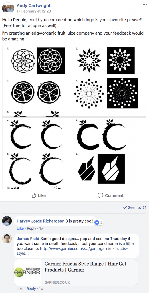
After creating my logo’s I posted them on our University’s Digital Media page on Facebook to get feedback from my peers. Here is the post:

Screen Shot 2018-02-25 at 18.10.37

Screen Shot 2018-02-25 at 18.11.01

Screen Shot 2018-02-25 at 18.11.13

Overall, the general consensus from the group is that Logo no. 3 is the most preferred. Although this is what the majority of people chose, I’m still not entirely happy with this design and might change it so it has better use of negative space, to which the colour of the juice itself can show through. In addition to this, after talking to my tutor it was suggested that the logo should change depending on the juice drink, because I wanted to have 3 different types, I theorised that I could change each of the logo icons to a fruit that represents the drink, e.g. a strawberry juice could be represented by a strawberry logo. The design variation of this would work well as the brand name ‘Fructus’ (which I deemed to be appropriate after concerns were mentioned about its closeness to Fructis) would help create synergy and coherence between all of the different products.

Whats Next?

I am going to redesign my logo with three variations for the different flavours, whilst also incorporating a good use of negative space to which I desire the juice colour to be visible through. As well, I would also like to incorporate the minimalist theme that was conceived from the beginning of the project.

Anchor Links

As the last part of my Muse research, I wanted to explore what Anchor Links are. From previous projects I have used them before, however, since then I have completely forgotten how to use them. By researching them it would a good opportunity to refresh my memory o them and also explore what other options I have available for using them.

Exploring YouTube, I found this video below explaining how to use them exactly within a one-page website. Here it is:

From the video, I found that the anchor link system is often used on a one-page website. In the example above, the man used different coloured sections to represent different parts of the website, and then used the anchor point tool, denoted by an anchor symbol in the toolbar to add different points on the page that were then named. From this, each of the anchor points was placed in the centre of the page of every section and then linked accordingly via the hyperlinks tab to the menu. This enabled all of the links to redirect the user to relevant sections (if linked correctly).

Conclusion:

I feel that using this on a one-page website is very practical as it saves the user from having to scroll a lot. However, from my plans, I decided to use multiple pages in order to break the website up which I feel would make it easier for the user trying to find info about my product. I will have to research further to see if I can still use the anchor points to link different pages together, and if not, I will have to find a solution which will work for me.

Rollover Effects

Along with my Adobe Muse research, I wanted to explore my options with Rollover Effects. From my previous projects, I have experimented with different rollover effects to support a product by revealing additional information about a topic – this was a really inventive way to display the information without cluttering up the webpage, but it also helped to increase the presentation quality. By further exploring my options into all of the different rollover effects I would be able to achieve, I will be able to select the ones that would be best suited to complete the function that is desired, either being an animated rollover effect for a button or image.

From a generic YouTube search, I came across a plethora of videos discussing rollover effects within Muse, and after watching multiple I concluded that they all gave the same information. However, here’s two really good examples of rollover effects used in an aesthetically pleasing way:

From the videos, I have learnt that the basic form of rollover effects stems from the states panel at the top left of the screen. In simple terms, one object on the website can have 4 different variations due to the 4 states that it can be in Normal, Rollover, Mouse Down and Active. This is where the predominant changes can happen, and when these changes are made, they don’t affect any of the other states. For example, A square in the ‘Normal’ state could be coloured grey, and then, if the state of the object was changed into ‘Rollover’, the user could then change the colour to red. This would mean that the square in the browser would be grey until the cursor rolled over it.

Although very simple, this could then be developed by adding extra elements such as lines, like in the video above, further adding to its visual complexity. The same rules also apply for images where one image can be programmed to change to a different image once rolled over, which can also be further stylised with transition effects such as a transition period and delay, defining how long it takes the images to transition to one another, and also how long it takes for the transition to begin after the cursor hovers over the image.

Conclusion:

Although these rollover effects for both buttons and images demonstrated within the two videos are aesthetically pleasing, their design style might not be suitable for my product and the image I want to create for it. I feel the rollover functionality on the images is dated and would benefit more from a Parallax effect being used on it with a scroll effect, however, this is not to say that I would completely disregard the use of rollover effects, as I have found another tutorial on a rollover home/back button which is very interesting.

They use of this, although made completely redundant by the back buttons available on the browser does add a nice effect and is also executed by effectively.

Scroll Effects

Within Adobe Muse, there are some really creative ways to add movement to your website known as scroll effects. These usually take the scrolling feature of your mouse to play with the movement of different assets within the webpage. After creating a plan for my website, I already knew that I wanted to incorporate this feature into the History page where the scroll feature would allow the user to scroll through the company history and see where it started. After a search on YouTube, I came across this video which was coincidentally by the same author of the Responsive Design video. Here it is:

From this video, it taught me how to incorporate these scroll effects into the design my website. Using the Scroll effects tab on the right-hand side menu, I will be able to select an object that I want to have animation and check the motion box. By doing this I am able to establish the key position of the object, meaning the position it starts at and also gives me the ability to state the direction and speed the animation occurs, which is defined by the scroll rate, meaning that if the speed is at 2, the animation will play through on the website in the browser at twice the speed of scroll. These rule also apply to the existing animation of the object during the period it animated out, the exit direction is defined as well as the speed allowing to fully animate in then out again.

Following from this, I will also be able to control the opacity of object through the use of the scroll functionality, this is done in the exact same way, however, the start and end point need to be defined denoting what the starting opacity will be and what the ending opacity will be. I feel that this coud be useful within the history page as I want it to fade in from right to left and exit the same way, by perfecting the opacity I will be able to add smoothness to the animation, thus increasing the quality.