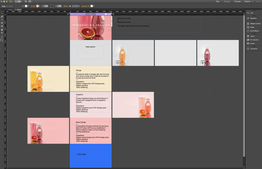
Once all of the renders had been completed, it was time to start constructing the website in order to host them on all. Stated in a planning post before, I already had had a clear idea and plan about how I wanted the website to be constructed, however, since that the design an aesthetic of product had changed. Due to this factor, I decided to adhere to a one-page design, where the whole website for the company would consist of 1 page to display information on the company, the products, and the animation. Below is a screengrab of the early development of the website and denotes how I had sectioned each part for relevant topics.
Further on into the development of the website, I started to incorporate text onto the pages, adhering the house style that had been used on the labels for the products, e.g. white text and Futura PT font.
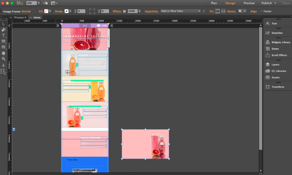
To ensure that all of the text elements present on the page were aligned correctly in comparison to the rest of the website, I used coloured guides to make sure that the text was at the same level (seen below) – this was particularly useful for the products section as the images were placed on alternate sides, making alignment more difficult. However, because of the guides, I was able to get them in roughly same position.
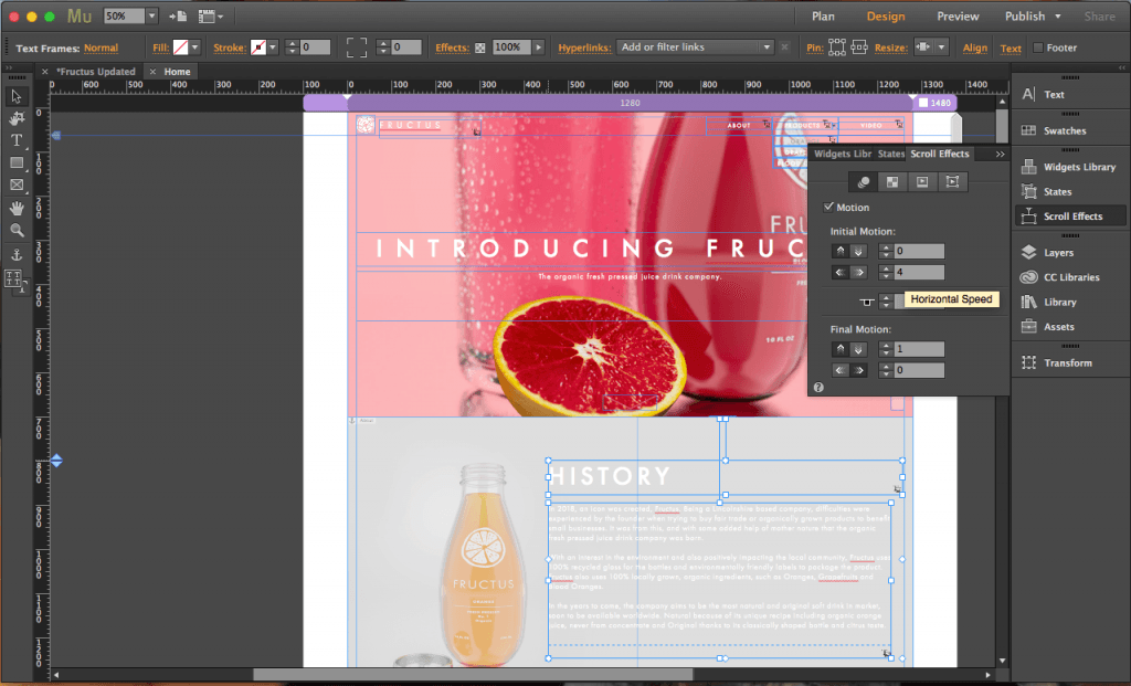
After all of the text elements were placed correctly, it was then time to add scroll effects to the text and background images. The screengrab below shows my process of editing text scroll effects so that they enter into the window from the right:
Still to add to the website is the animation, once added this will fully complete it. However, it is key to note that all of the other features are completed bar this one element.


