Reflection

Overall, this project has been an enjoyable experience that has presented challenge and obstacles to overcome. I feel that using Cinema 4D and Adobe Muse this semester has been greatly beneficial, as I have been able to learn a lot of new techniques and also had the opportunity to implement prior skills learned from previous semesters. I feel that pushing myself into the Photorealistic avenue with this project has further sparked an interest to pursue this after education, I enjoy achieving a high-quality standard with my work and also tackling the challenges when this standard is not met.

Whilst taking this journey, I encountered a lot of difficulties. As my project was so unique, it was sometimes very difficult to find direct solutions to my problems, and as a result, I ended up conducting a lot of tests outside the main project in order to try and solve them. Additionally, not all of my problems where technical, some of them were subjective as I would work on one aspect of my project for such a long time where it would begin to blur together, for example, spending hours making small changes to the liquid colours inside the bottle to try and make it look aesthetically pleasing.

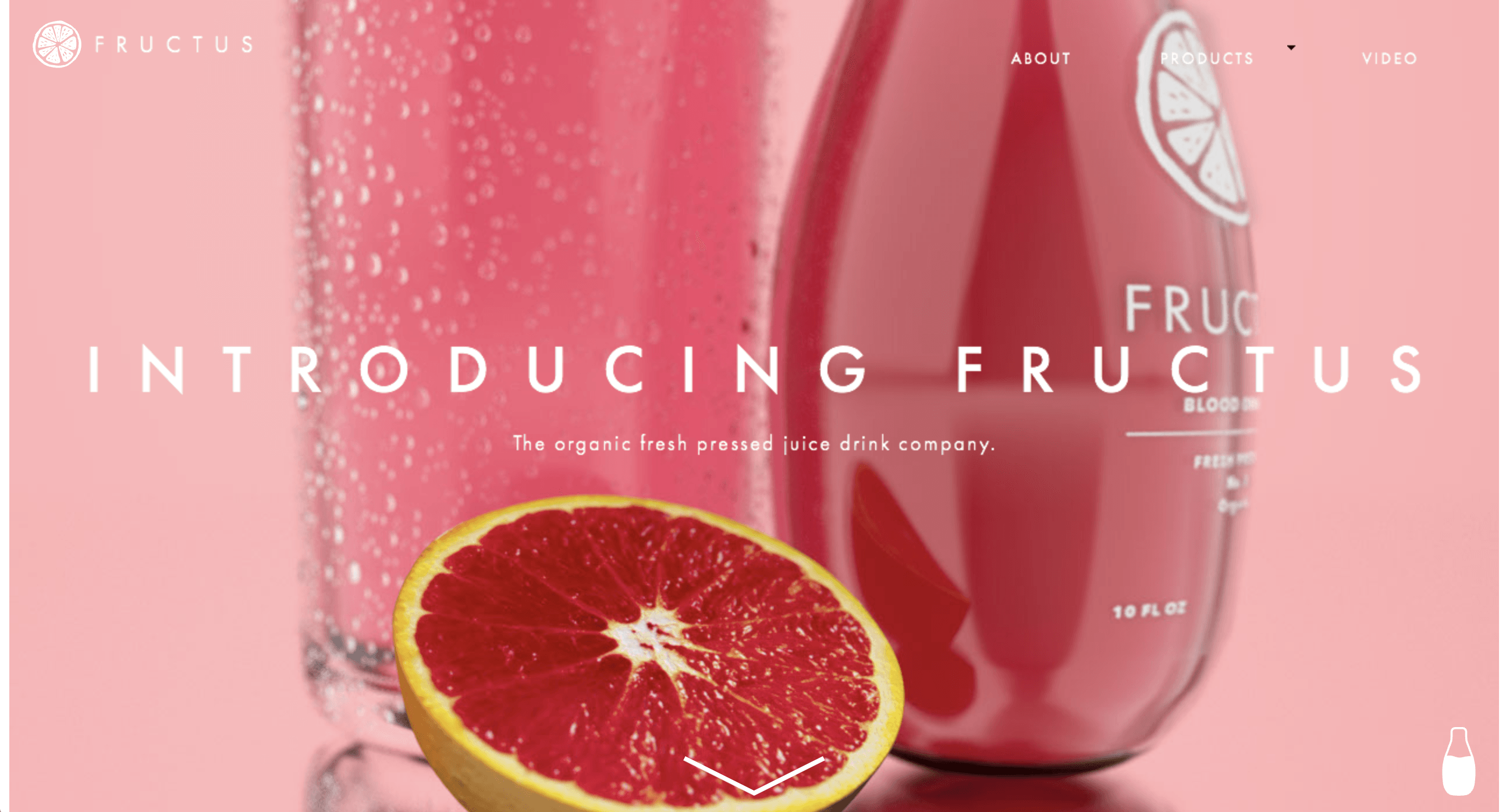
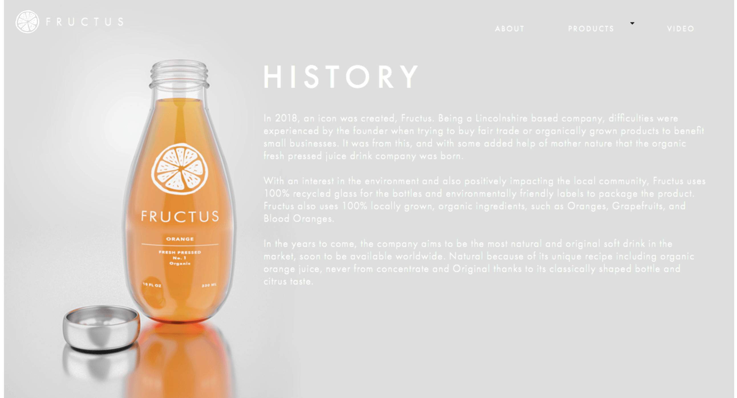
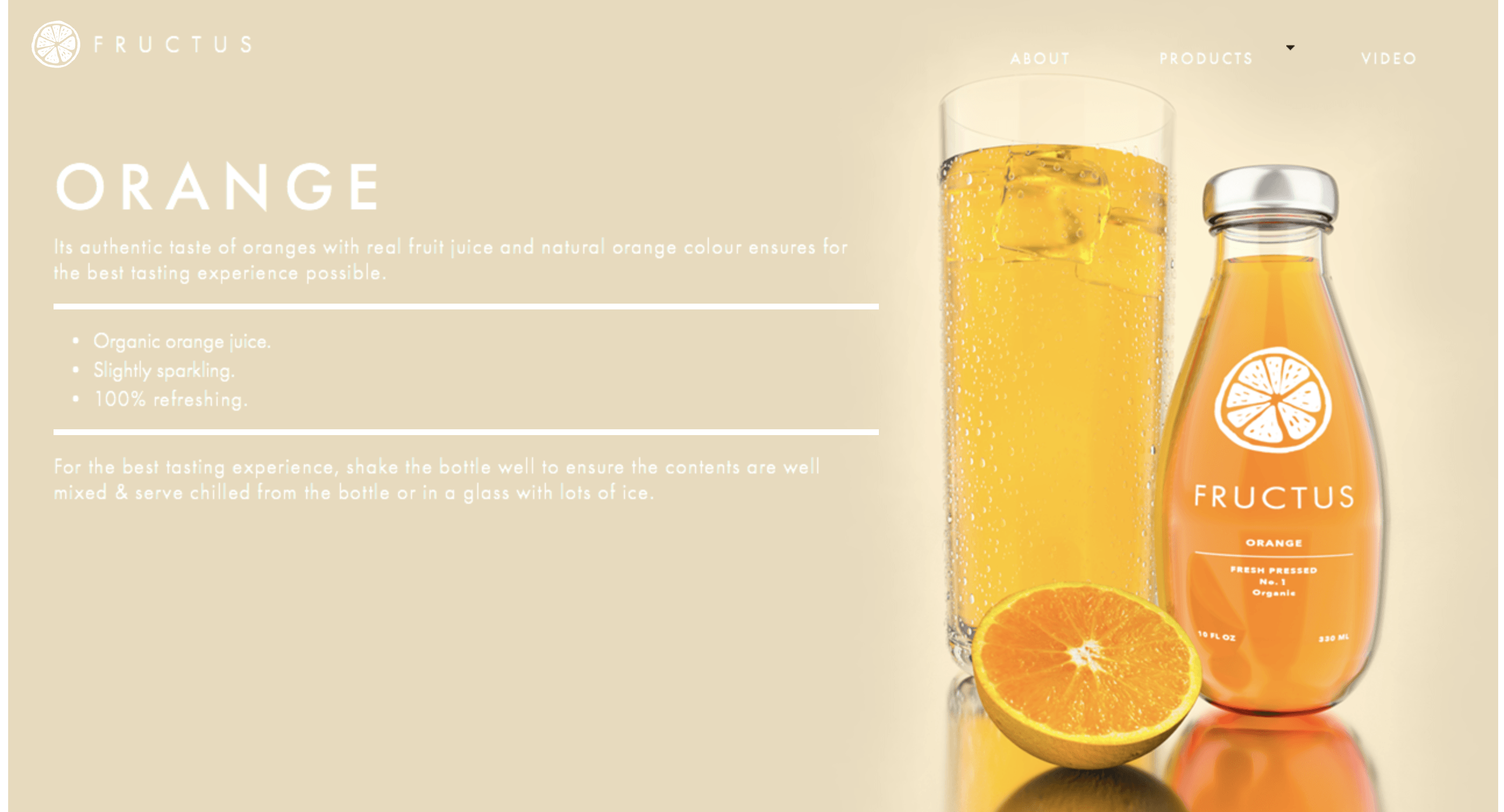
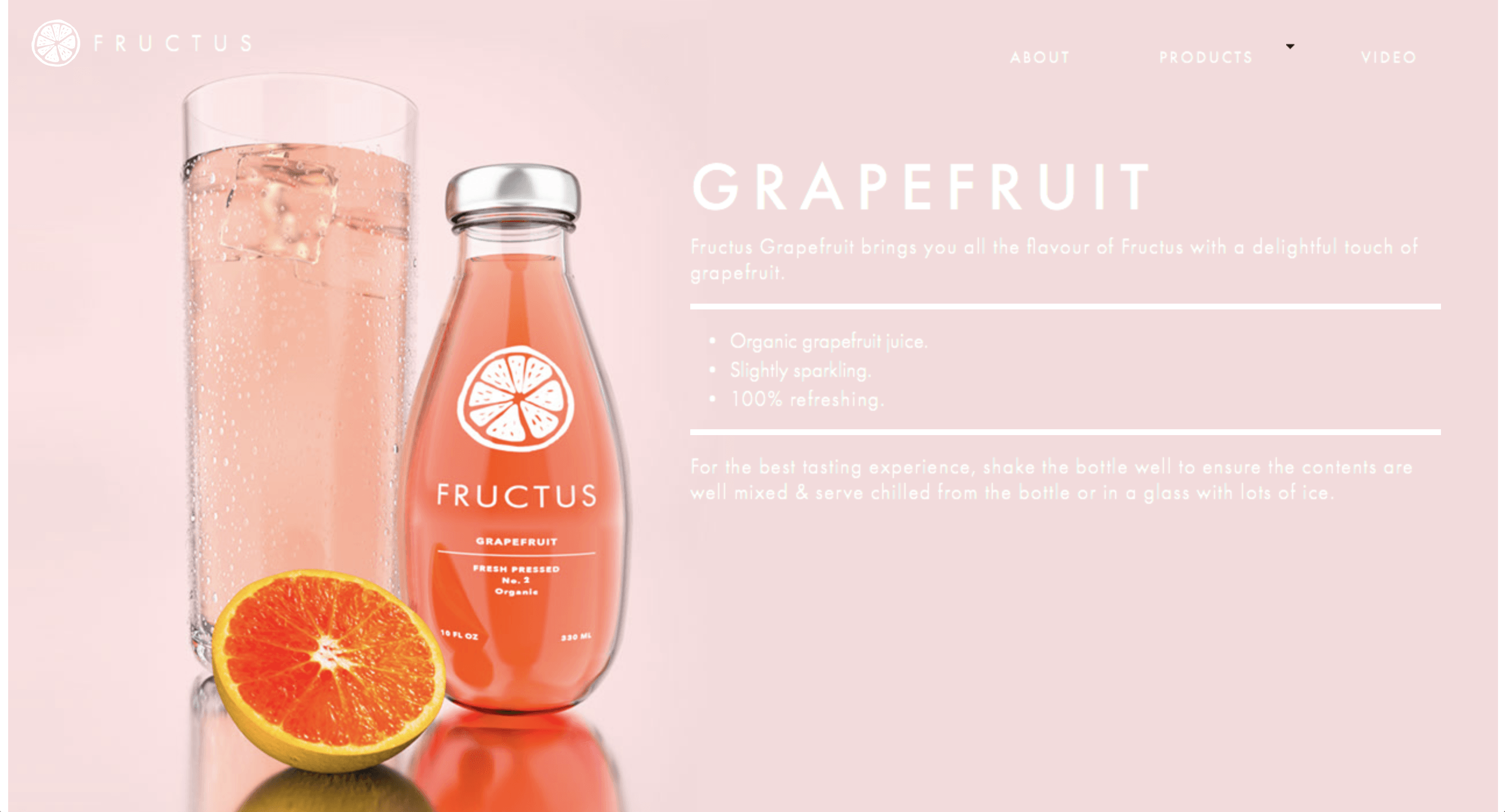
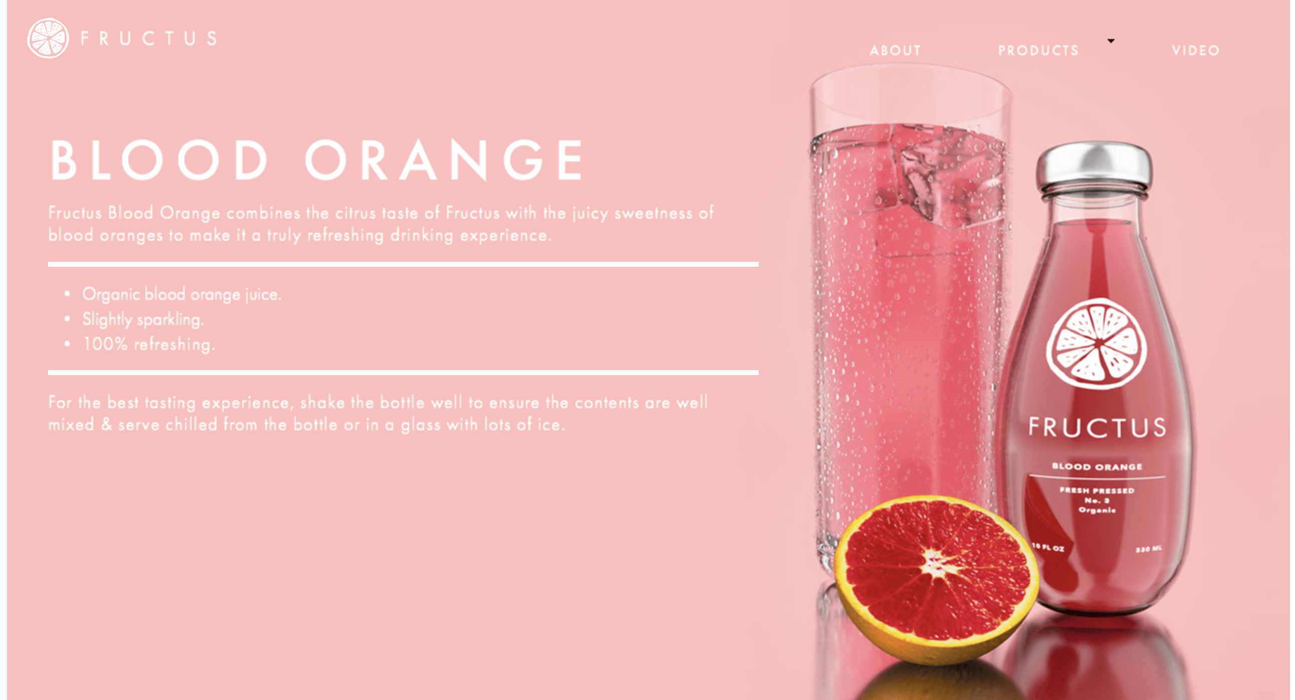
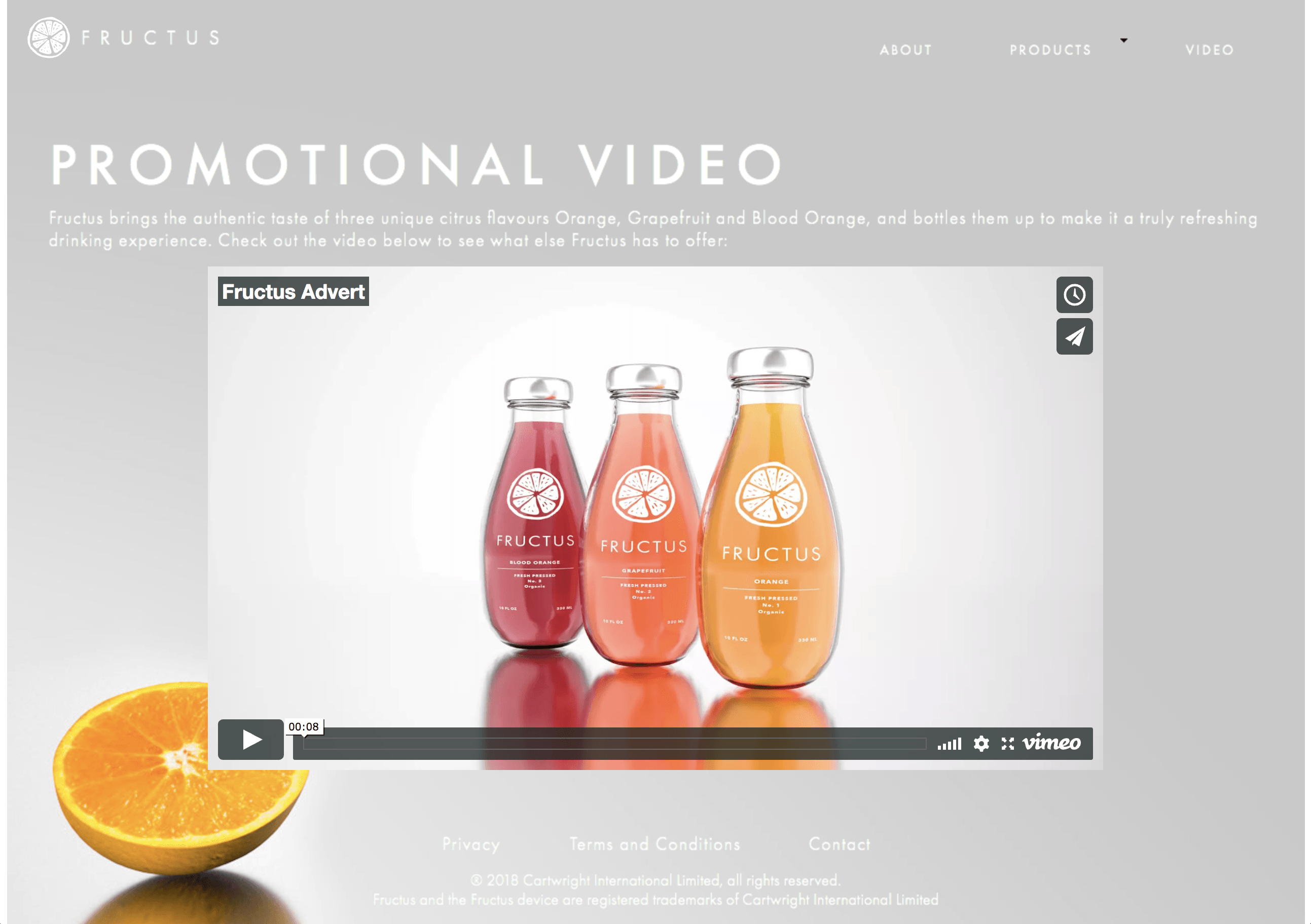
One of the most challenging problems I faced was finding a new background environment for the product. Discussed in a blog post, when I first created my project I wanted it to be placed into a scene where it best represented the ingredients origin, however, after discovering that this wasn’t a viable option anymore, I had to search for something different. Fortunately, I had watched a tutorial online that had shown how to make a studio scene with a reflective floor, and the aesthetics that it achieved were very appealing, so I decided to create my own variant of it which solved my issue. In addition, I also experienced similar aesthetic problems in my website creation. Because the white text colour used on the label of the product, I had to make a lot of adjustments to the background images on the website. This was to ensure that there was enough contrast between the two visual elements to make it information legible, as theres no point in having text on there if it cant be read.

When approaching projects like this in the future I would allow myself more time to research and experiment with realistic or PBR materials. In my Gantt chart, I highly underestimated the amount of time I would need to research all of the different elements that would form the basis of my models, and because if this, I felt like it could have been much better. In addition, I feel that the composition of my renders could have also been improved from additional time. This is, in my opinion extremely noticeable in the three main renders for the different flavours, as the overall image doesn’t have that balanced aesthetic that I would like, however, this is just a small criticism as it still achieves photorealism which was desired from the beginning.

Project Update #3

The company website has been completed! Within the video below, I discuss the key areas of that website, showing all of the visual effects – such as fade in’s and text movement that I had created in Adobe Muse. As well I also give a brief breakdown of the sections, which you can see below:

Overall, I am very happy with the way the website turned out as I feel all of the outputs look very appealing together and also complement each other nicely. Displayed below is the link to the functioning website, which you can check out to experience all these features: https://drive.google.com/open?id=1PjdfGnUSKail0MXUiciESgQ04PUdPMdH (Download the .zip, and then open the .html file!)

Alternatively, here are some screengrabs of the final website:

Screen Shot 2018-04-25 at 19.27.10 Screen Shot 2018-04-25 at 19.27.47 Screen Shot 2018-04-25 at 19.28.07 Screen Shot 2018-04-25 at 19.28.19 Screen Shot 2018-04-25 at 19.28.32 Screen Shot 2018-04-25 at 19.28.52

Logo Feedback

After creating my logo’s I posted them on our University’s Digital Media page on Facebook to get feedback from my peers. Here is the post:

Screen Shot 2018-02-25 at 18.10.37

Screen Shot 2018-02-25 at 18.11.01

Screen Shot 2018-02-25 at 18.11.13

Overall, the general consensus from the group is that Logo no. 3 is the most preferred. Although this is what the majority of people chose, I’m still not entirely happy with this design and might change it so it has better use of negative space, to which the colour of the juice itself can show through. In addition to this, after talking to my tutor it was suggested that the logo should change depending on the juice drink, because I wanted to have 3 different types, I theorised that I could change each of the logo icons to a fruit that represents the drink, e.g. a strawberry juice could be represented by a strawberry logo. The design variation of this would work well as the brand name ‘Fructus’ (which I deemed to be appropriate after concerns were mentioned about its closeness to Fructis) would help create synergy and coherence between all of the different products.

Whats Next?

I am going to redesign my logo with three variations for the different flavours, whilst also incorporating a good use of negative space to which I desire the juice colour to be visible through. As well, I would also like to incorporate the minimalist theme that was conceived from the beginning of the project.

Logo Development

Time-lapse:

Below is a time-lapse of my logo development showing the complete process from start to finish of all of my logos I made. When creating all of the different variants of all of the logos, I made sure to include a wide range of artistic styles to reflected the ethos behind the company (edgy and organic) – this was to fully cater for the target demographics personal tastes in artistic styles. Additionally, Some of the logos that are produced have also been displayed in white on black and also black on white – This is to fully reflect how logos looking different circumstances and also to give the audience a better view as to how it might look into different colour variations.

Final Logo’s:

Below are the finals logos produced, from the time-lapse above you can see how some of these were made – Some of the logos were quite difficult to make as they were very intricate, e.g. Logo #1 and oppositely similar logos were very simplistic and easy to make, e.g. Logo #9. Overall I feel very happy with how all of the logos turned out and I feel that logos #3 & #5 are my favourite, however I feel that I will have to take into consideration the target demographics opinion when finalising my decision on which logo to select from the company.

Artboard 1 copy 3 Artboard 1 copy 4

After producing all these logos, I’m going to post these to social media for my peers & target demographic to give feedback on – This will not only help me to communicate to my target demographic, It will also enable me to get some feedback from them and understand how they think about images and how they relate back to the brand.