Animation Video Creation

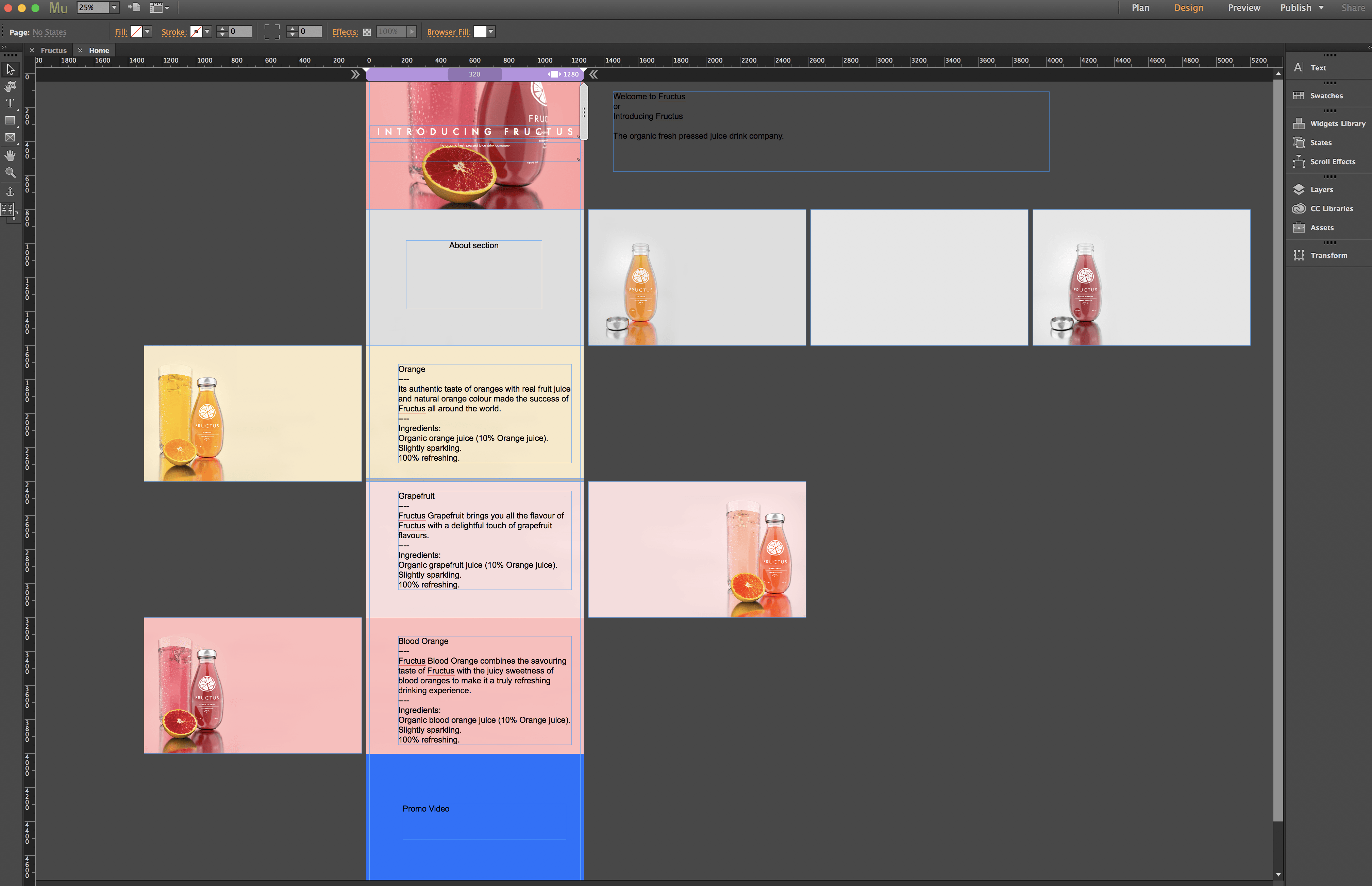
As stated in my Learning Agreement, I also wanted to produce an animation for the company that would advertise the products. From my storyboarding that was completed in the planning phase of the project, my initial concept for this was have the product rolling in from the right on a flat surface, it would then come to a stop on the left side of the screen with the company logo and slogan fading in afterward.

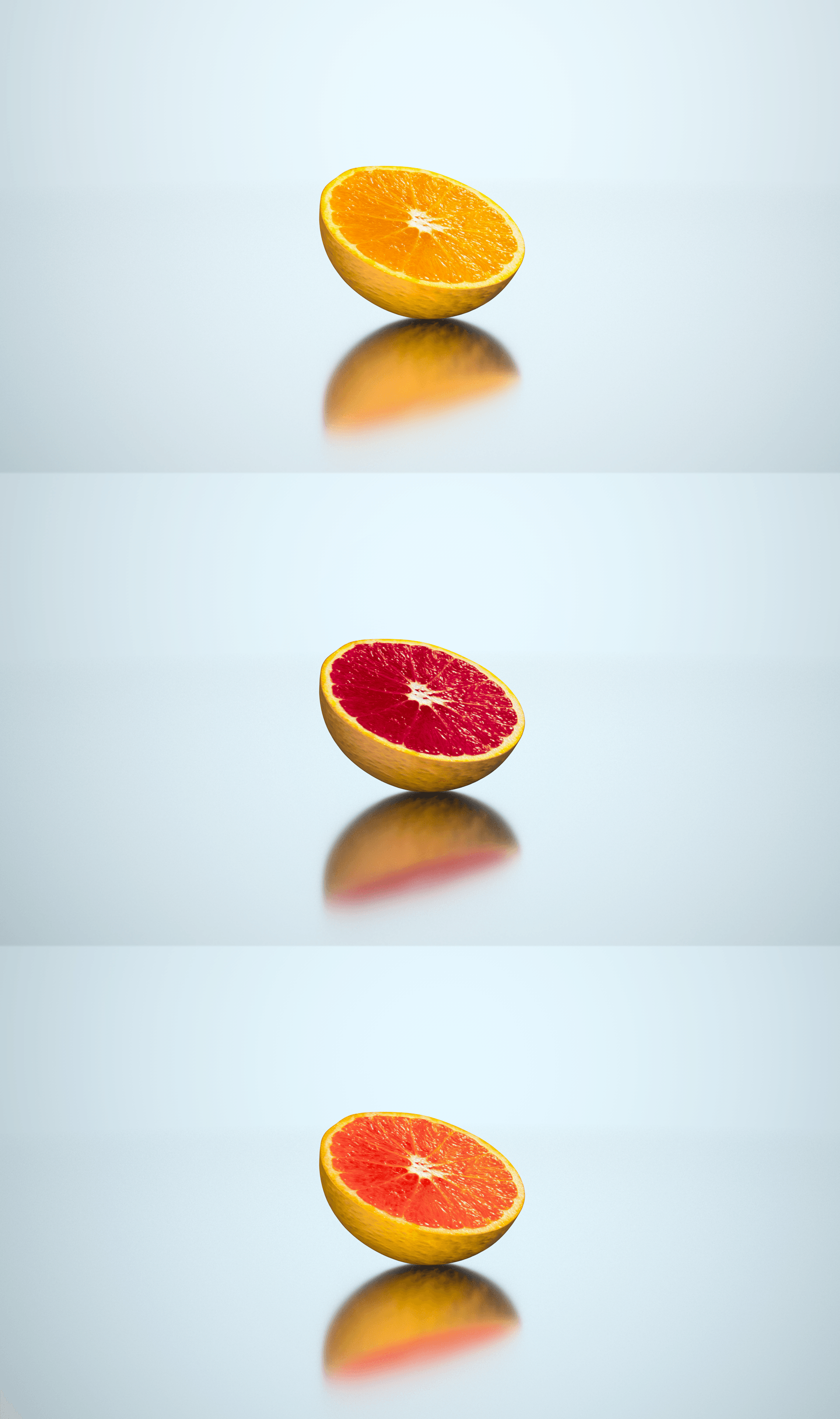
However, as my aesthetic changed, my idea had to also change. I settled on a minimalist animation, denoting the products spinning into the shot from the right, this allowed the audience to observe all of the products available to them in one video. This creative process can be seen below in a timelapse:

Creating the animation was a very challenging experience. First of all, after then exporting the footage from AE and taking it into Premiere Pro, I had to research online for different royalty free sound effects libraries to bring my animation to life. This was hard because all of the free sounds that were available to download had poor quality, I spend a lot of time looking through and listening to them all before actually downloading them, which further made the task more time-consuming. Additionally, once I had sourced all of the sounds, I had the added task of editing them together effectively so that they seemed real and in time, I wanted to make sure I got this section of the animation completed well as poorly timed sound is very noticable and would lower the overall quality level of my work.

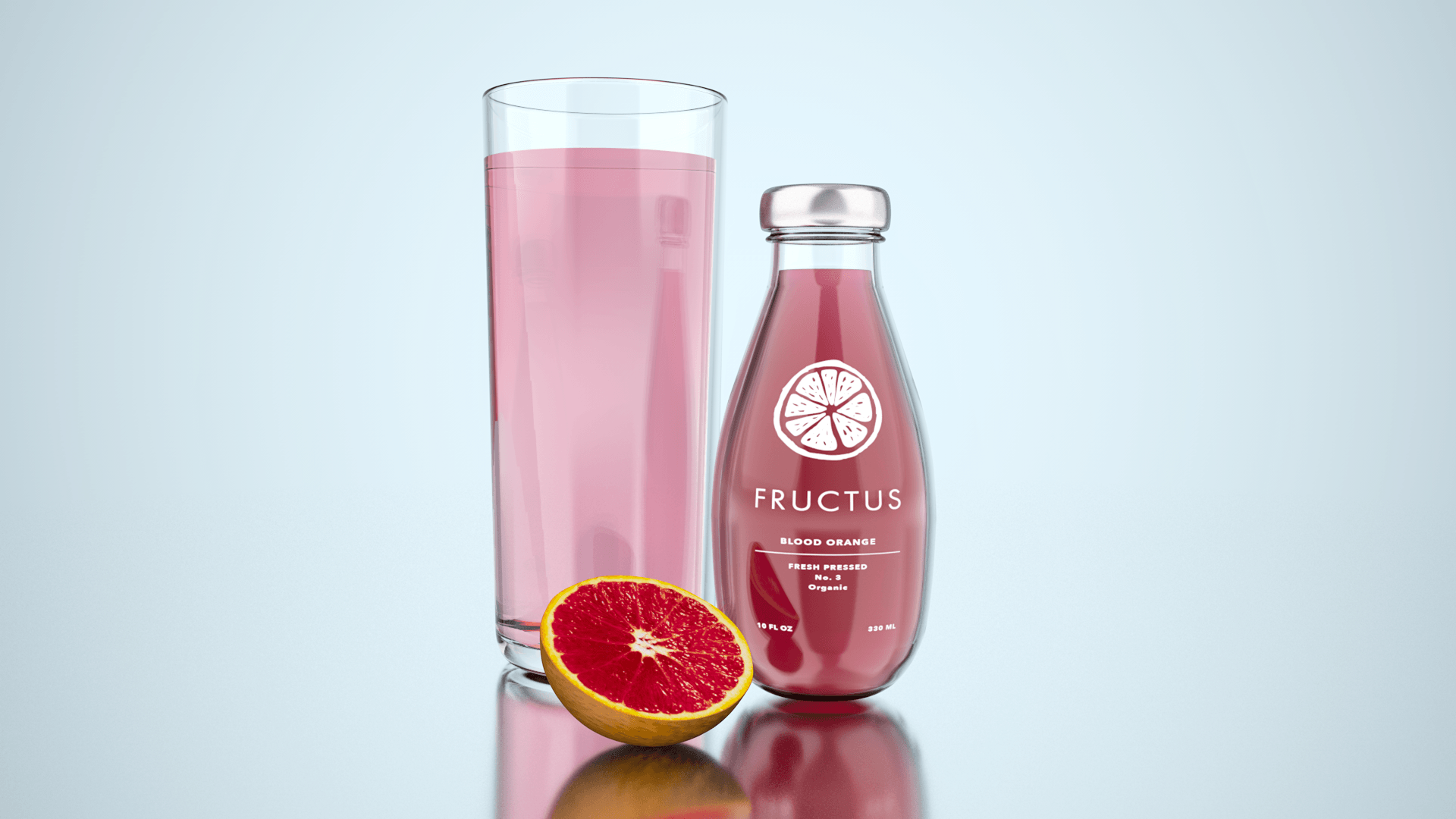
But, after all of that, I managed to complete the animation to a standard which I was happy with. This can be seen below:

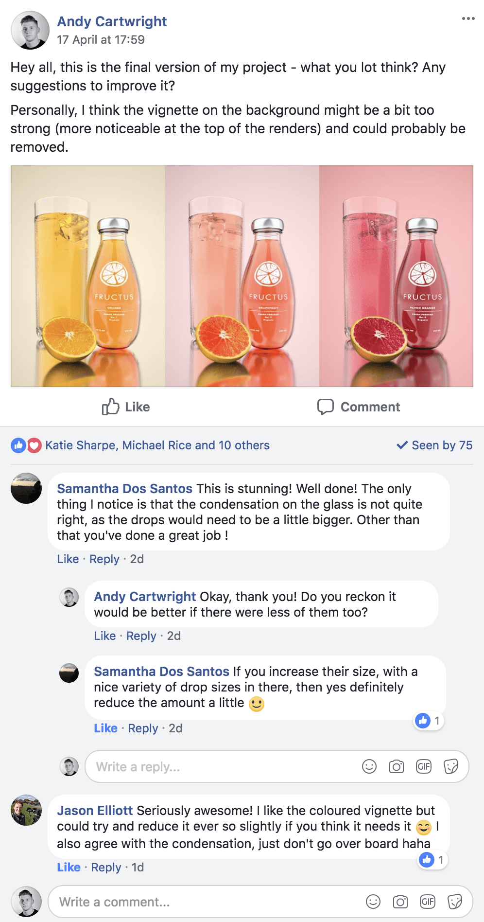
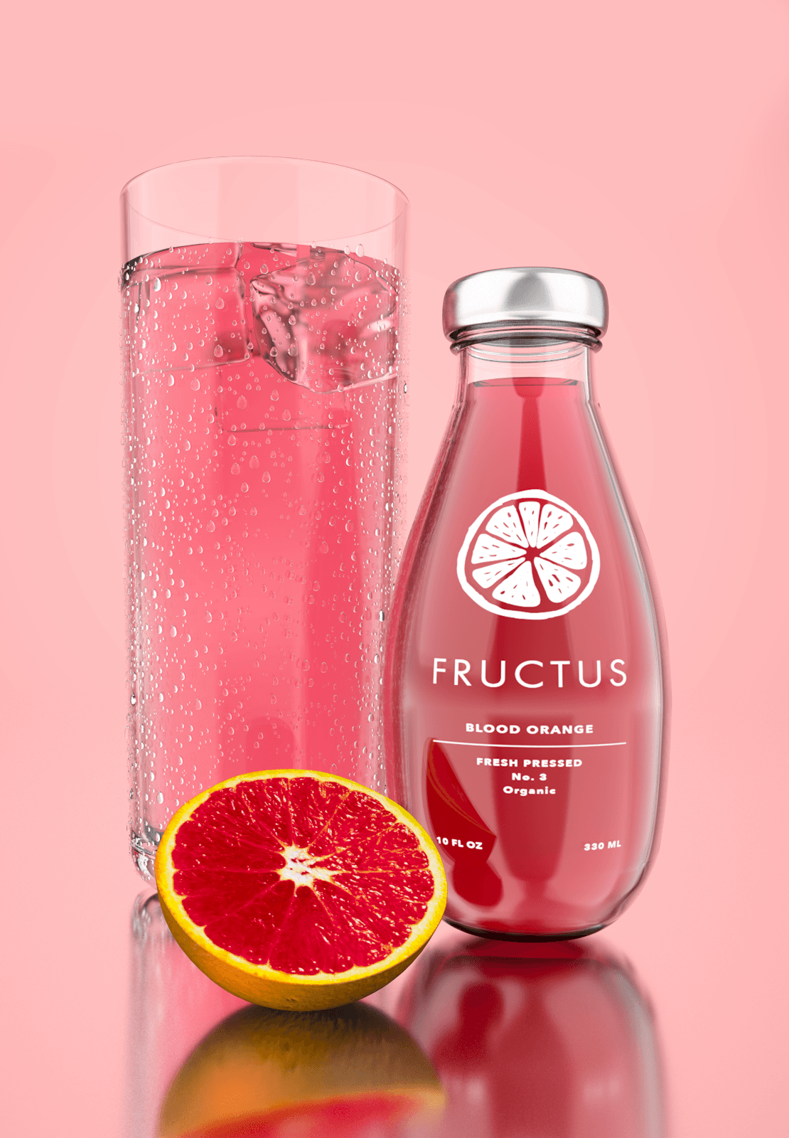
For a short animation, I believe it advertises the company products very well, it shows everything they have to offer in a short amount of time which will appeal to the target audience who are on the go.

Project Update #2

Once all of the renders had been completed, it was time to start constructing the website in order to host them on all. Stated in a planning post before, I already had had a clear idea and plan about how I wanted the website to be constructed, however, since that the design an aesthetic of product had changed. Due to this factor, I decided to adhere to a one-page design, where the whole website for the company would consist of 1 page to display information on the company, the products, and the animation. Below is a screengrab of the early development of the website and denotes how I had sectioned each part for relevant topics.

Screen Shot 2018-04-21 at 11.51.19

Further on into the development of the website, I started to incorporate text onto the pages, adhering the house style that had been used on the labels for the products, e.g. white text and Futura PT font.

To ensure that all of the text elements present on the page were aligned correctly in comparison to the rest of the website, I used coloured guides to make sure that the text was at the same level (seen below) – this was particularly useful for the products section as the images were placed on alternate sides, making alignment more difficult. However, because of the guides, I was able to get them in roughly same position.

Screen Shot 2018-04-23 at 00.51.22

After all of the text elements were placed correctly, it was then time to add scroll effects to the text and background images. The screengrab below shows my process of editing text scroll effects so that they enter into the window from the right:

4f09032e-fffe-468a-adcb-1eed245c8820

Still to add to the website is the animation, once added this will fully complete it. However, it is key to note that all of the other features are completed bar this one element.

Project Update #1

As the deadline is fast approaching, I have made the decision to round off all of my major developments into one video (this video) so I have more time to spend on my project. Here are the major developments:

After creating the renders, I am next set to create the website in Adobe Muse. In my next video I will discuss the major developments and show my progress that I have made within the week.

Audience Feedback

After completing my first render for the product, I went to social media, specifically the Digital Media or ‘Digibods’ page to get feedback from my peers. From the screengrab below, you can see the feedback:

Screen Shot 2018-04-20 at 11.59.58

Overall, the renders got really positive feedback, with many people liking it, which is really good! I also got feedback mainly about the condensation droplets size as two people thought that it was too small and didn’t look realistic enough – from this feedback, I have then made corrections to the renders and my final versions can be seen below.

Renders:

GrapefruitOrangeBoold Orange RAW

The droplet sizes have been increased and I have also changed the rotation of the ice cubes & fruits slightly to add to the variation. I’m really pleased with how it turned out & I’m excited to start on the website creation to contextualise it all.

Fruit Texturing

After successfully creating the orange and integrating it into the current and latest version of my project, I continued to make the other fruits – the grapefruit and Blood orange:

In the timelapse I showed myself cutting out the inner flesh of the fruit in Photoshop, isolating the inner section so I could alter the colour whilst retaining the original look for the skin. However, I forgot to record the last half of this stage where I implemented it into C4D – This section was very tedious as I was making small alterations to the hue, saturation and vibrancy of the image to make it look more realistic and to also achieve the desired look which I had envisioned, which can be seen below.

Renders:

Final

I’m really happy with the way these turned out, they look really good and are a close representation of real fruit versions. When it comes to rendering these out with all of the assets together, I will alter the rotation, scale and the displacer to create slight variation between the different fruits. In addition, I can further change this by editing the original image in Photoshop if a more drastic visual change is needed.

Whats Next:

Next, I need to edit the liquid materials so that they compliment the colour of the fruit further – denoted in the render below its visible to see how the colour of the fruit doesn’t match the colour of the liquid. In addition, I also need to add the ice cubes to the glass to make it look desirable, cool and refreshing.

fruitzzz