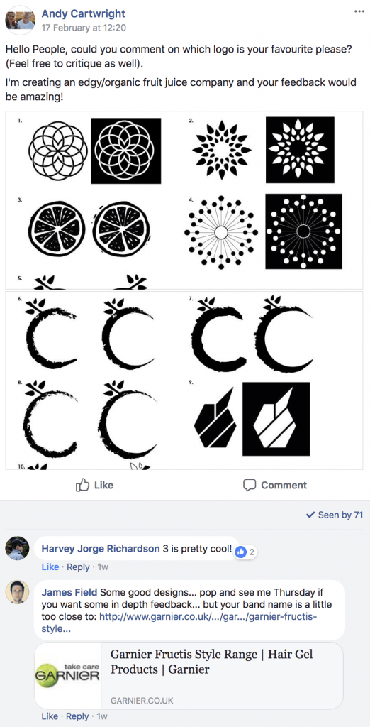
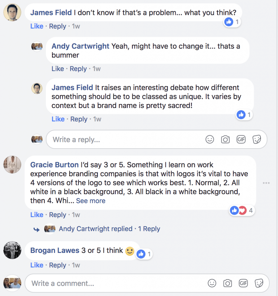
After creating my logo’s I posted them on our University’s Digital Media page on Facebook to get feedback from my peers. Here is the post:
Overall, the general consensus from the group is that Logo no. 3 is the most preferred. Although this is what the majority of people chose, I’m still not entirely happy with this design and might change it so it has better use of negative space, to which the colour of the juice itself can show through. In addition to this, after talking to my tutor it was suggested that the logo should change depending on the juice drink, because I wanted to have 3 different types, I theorised that I could change each of the logo icons to a fruit that represents the drink, e.g. a strawberry juice could be represented by a strawberry logo. The design variation of this would work well as the brand name ‘Fructus’ (which I deemed to be appropriate after concerns were mentioned about its closeness to Fructis) would help create synergy and coherence between all of the different products.
Whats Next?
I am going to redesign my logo with three variations for the different flavours, whilst also incorporating a good use of negative space to which I desire the juice colour to be visible through. As well, I would also like to incorporate the minimalist theme that was conceived from the beginning of the project.


One thought on “Logo Feedback”
[…] posting my different logo designs on social media for feedback, the general consensus from the group was that the third logo or the half cut […]
Logo Update | Media Project Two